AfterGlow 1.5.9 is out. It's not a huge release, but it allows for some new things that, for example, Tenshi needed to make it more useful. The feature that helps there is that you can now dynamically change node labels.
Another new feature is the addition of URLs to nodes. This is needed to support image maps. If you generate an image map through GraphViz (-Tcmapx), you can provide URLs that go along with the nodes. If you then use that image map in an HTML file along with the graph, you have an interactive graph. If you are interested in how this looks, I blogged about a Splunk - AfterGlow integration on my Splunk blog. The new search command I built, is using image maps to build an HTML file, which is then linked back to Splunk. Check it out.
Hi folks,
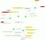
I wanted to see if I could hook up Tenshi, a log monitoring application, with some pretty graph, for a long time. The current tree supports a csv output feature that allows pipeing to something like AfterGlow.
In order to get this you can use something like this in your tenshi configuration (if you use the latest version from the tree):
set csv [0 * * * *] /usr/local/bin/tenshi_graph.sh
Where tenshi_graph.sh could be
#!/bin/sh
/usr/local/bin/afterglow.pl -c /etc/afterglow.conf -t | neato -v -Tpng -o /var/lib/tenshi/tenshi_graph.png
and afterglow.conf configuration could be something like
color.source="green";
color.target="red" if ($fields[2] > 1000);
color.target="orange" if ($fields[2] > 500);
color.target="blue" if ($fields[2] > 100);
color.target="lightblue" if ($fields[2] > 50);
color.target="yellow" if ($fields[2] == 1);
color.target="white";
This allows having target node colours depending on the number of hits of the affected log, but of course it might be whatever conditions you want. You can see how it's possible to quickly evaluate logs that are common to different servers and their frequency.
Keep in mind that in order to have useful and readable graphs your tenshi configuration must be accordingly tuned. Arbitrary logs in the csv queue would quickly generate huge and unreadable node maps.
This is just an example, more advanced processing can be done. If you have new ideas please share them on tenshi-user@lists.inversepath.com mailing list and/or the SecViz portal :).
Cheers!
Andrea Barisani
andrea@inversepath.com
I’ve wanted to post this graph for a while but only just got round to anonymising the data.
Looking at piles of IRC logs can be very unilluminating, but it’s not obvious what to do with all the data. One nice way of getting a handle on links between channels is to plot channels with links between them weighted by the number of users in common.
The example above is from a honeynet we ran in 2004/5. The graph shows up a couple of things nicely:
1) There are two distinct groups of channels, and a look at the data shows that there two groups correspond to channels in different languages and,
2) The strong links between a couple of channels in the main group show up that these channels are related and looking at the data shows them to be used for discussing hacking, while the other channels are innocuous.
The original channel names have been replaced by ‘cN’ to protect the guilty.
For a full size copy of the image, see UK Honeynet blog where this was first posted.
Arthur
VizSEC 2007 Workshop on Visualization for Computer Security
To be held between October 28 and November 1, 2007 in Sacramento, CA
http://vizsec.org/workshop2007/
The VizSEC 2007 Workshop on Visualization for Computer Security will provide a forum for new research in visualization for computer security. Building on the success of the previous three VizSEC workshops, we will again be meeting in conjunction with the IEEE Vis and InfoVis Conferences. The workshop will be held in Sacramento, CA USA between October 28 and November 1, 2007. The exact date of the workshop is still to be determined by the Conference committee; please check the web site for further details.
Reasearchers and practitioners from academia and industry are encouraged to submit papers and attend the event. We are looking for diversity and are particularly hoping that practitioners who have experience designing and using visualization in the field will consider joining us. Please see the web site for further details: http://vizsec.org/workshop2007/
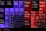
This is a first attempt at visualizating open ports detected by nmap in around 60 servers.
I've used Freshcookies-Treemap and custom scripts.
Ports are all TCP.
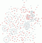
A directed graph of intranet SSH sessions as recorded by Argus, graphed using the "two node mode" of afterglow. Data collected with Argus V3.0 from multiple Cisco Netflow sources, graph generated using AfterGlow v1.5.7 and Neato v1.16, all running on OpenBSD.
The latest version of Argus can directly output CSV, so argus2csv is no longer needed. This particular graph was generated by the following:
racluster -r argus.cap -m saddr daddr dport -c, -s saddr daddr - 'tcp and dst port 22' | kevin-anonymize.pl | afterglow.pl -t -e 2 -c test.properties | neato -Tgif -o tcp22argus.gif
This directed graph reminds me of the social network you might see in a suburban high school, and revealed to us some interesting things, including the existence of a new network monitoring tool quietly installed by a rogue internal unix admin team... us and them, we're having a "come to Jesus" meeting tomorrow ;)
The DHS just released a solicitation for various security-related research projects among them TTA 4 - Network Data Visualization for Information Assurance. I am very pleased that the DHS puts visualization as one of their nine main concerns.
I am somewhat concerned with the solicitation however. They mention SiLK as one of the tool sets which the US-CERT uses a lot. And they would like to see visualization tools enhacing that suite. I am not sure that's the right thing to do. I think we need tools which do not just look at traffic flow information, but at all kinds of different data sources!
I am very curious what type of tools and solutions will be submitted for this and would love to see some advances and new approaches. Anyone going to submit?
So what are the benefits of visualization over other techniques? My favorite answer is this:
There are many more benefits to visualization. Here are just a few:
I am curious what other's think. Let's add to the list!
The National Science Foundation (NSF) has a challenge for science and engineering visualizations published. I am not sure if I have some visualizations that would qualify for the challenge. But maybe some of you have security data that could make the bar. I think it would be great to draw attention to visualization in the security space. So if you have something. Submit it!
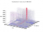
The red pillar in the image shows the barrage of HTTP requests over the whole content space (Z axis, vertical) from a single IP address (Y axis, horizontal). The red color is due to 5xx status code of the response. My article
A New, Improved Visualization for Web Server Logs has more details. Raju Varghese (raju -at- intellisoft.ch).
On his blog, Anton started an entry about logging and gets into the topic of too many logs. I was suggesting visualization to analyze the vast amounts of logs in order to get a better handle/understanding of them. Anton countered with this:
Is this really the place to start a visualization fight? :-)

You know what my issue with visualization are:
- tools need really skilled analysts
- often the resulting picture is no more insightful than the original
 log pile
- I kinda prefer an analytic system which is smart to a visualization
system which is... not so smart.

Let's move this discussion to secviz :-)
Here ya go. To answer Anton's objections:
Another excellent paper or in this case a survey. The authors do a great job of surveying the space of structured data visualization. They explain very well what graph layouting is, what the different algorithms are, where the problems are hidden, what the solutions are, how interaction plays into all of this, and also discuss three-dimensional views and what their benefit is. Awesome survey, really worth reading if you are interested in graph layouts.
I read a fantastic paper on visual perception. A must read for everyone designing visual systems. The paper is called Perception in Visualization, written by Christopher G. Healey. The paper is very very practical. It presents the theory behind perception very well and always gives examples. Some of the topics covered are:
It is fairly interesting to see how security prodcuts are maturing. In the last couple of years I have seen quite some progress in products using visualization. Let's look back a few years. Network-based IDSs, for example, logged events in a log file; text [and some still do!]. Over time, reporting was added; a way to summarize historical data. Drop a pie-chart on the report and you have something that you can hand to your collegues. Shortly after that dashboards came about. Finally we had something to show to our managers, not just our peers. Most products have a dashboard today. Not all of them are very useful, but at least they have one ;) The next evolutionary step was to link the dashboards with the data itself. Drill-down was added.
And this is where we are today. Most products are at this stage. Only a few products took this a steps further. They added for example dashboards that link to other dashboards, which show more specific information. Some products even offer customizable dashboards (not all do!). You have the capabilities to either build your own or change predefined ones.
There are only a handful of products in the security space which take visualization a bit more serious. Thos products offer visual interfaces which support dynamic queries [basically the capability to let you change/interact with the graphs on the fly.]. This is clearly how it should be. It gives the user the tools he needs to interact with the data.
I am very convinced that dynamic, interactive, visual interfaces are going to be added to more and more products. They are incredibly powerful and invalueable for data anlysis and representation!
I was attending the RSA Conference all week long. During one day my mission was to find out what the state of visualization in security products is. Here is what I found:
- Most products have reporting features
- A lot of products use dashboards which let you interact and drill-down into the details. This generally means clicking on one of the bars in a bar chart to get to the underlying textual representation of the events.
- Some products use drilldowns to get from one dashboard to another (nice!)
- Some proudcts let you customize the dashboards or change the visualization parameters interactively. Keyword: Dynamic Queries (very nice!)
- Only one company that I talked to uses a visual interface (a treemap) as their main way of interacting with the product. They even let you change the parameters on the fly! (very very nice!l!)
My whish list:
- More visual interfaces.
- More interactive dashboards. Being able to drill-down from one dashboard into another to get more information.
- More meaningful dashboards. Tell me why a certain graph is important in the dashboard. What's the use-case for showing it?
- More products using better visualization (have you heard of treemaps?)
- Interactive visuals. Let me choose how I want my data represented. Make it configurable. But don't overload the interface with features. Make sure there are valid use-cases and make them obvious to me! Wizzards?
I am pretty amazed with the Processing project. It's a full-blown, java-based programming language which has added commands to generate 3D graphs. I played around with it and pretty quickly built a tool which plots 3D coordinates which are stored in a file, onto the screen. It's fully animated, interactive, etc. The real killer is that the tool will generate a JAR with the entire code executable on Linux or Windows OR as an applet. Really worth having a look at!
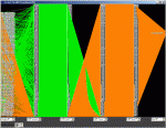
This is an image of a parallel coordinate plot (source IP, source TCP port, destination TCP port, source UDP port, destination UDP port, destination IP) that I created using the rumint visualization tool. TCP is in green and UDP is in orange. I deliberately jammed the visualization display by creating packets with random source IP addresses and sequential source and destination ports. If you are interested in more details they are available in this paper [PDF].
I just updated secviz.org to the latest version of the CMS. I also added a SPAM module. Let's hope this will help to control SPAM a bit better.
If you find any part of the page not working, please let me know: ram (at) secviz.org.
Thanks
The many eyes project is not focused on security visualization, but nevertheless, it's an interesting and very well done portal. What I really like is the interactivity. Play with some of the treemaps. You can reconfigure them on the fly. Very nice. I also like the explanation of the different chart types and when they are best used.