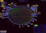
Tenable Network Security's Security Center includes a 3D visualization tool that can derive network topology information from distributed Nessus vulnerability scanners. Each node in the center helix of the above graph is detected router. Clicking on the router can expose the number of hosts "behind" each router. Placing your mouse over the node displays its vulnerabilities and placing your mouse over the router can display its links to other routers. The entire display can be rotated and loaded with different data sets. For example, a user could query the Security Center to get a list of all web servers, then perform a second query for all web servers which perhaps didn't have logging enabled and then display these locations on the topology. A video of the 3D tool in action is located here.
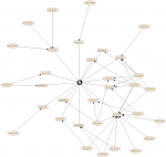
This graph was produced with vulnerability data sniffed by the Passive Vulnerability Scanner (PVS) from Tenable Network Security and AfterGlow. A blog entry detailing this graph is located at Tenable's blog. The PVS sniffs vulnerability data such as client and server vulnerabilities, but also network 'trust' relationships such as which machines connect to a server on port 22. In the above graph, a host with an arrow to another host represents that the PVS has observed at least one network connection between those systems.
I am quite frustrated with a lot of the research papers and tools that get published. In a lot of cases you can just tell that the authors and developers of certain tools have good intentions, but unfortunately no, or limited, domain knowledge.
One example was a recent paper I read about some visualization tool. They were talking about occlusion and how filtering can help address that problem. Absolutely. I could not agree more. However, the context was security alarms. It was proposed that one of the most effective ways to deal with occlusion was to filter based on the alarm priority and only show a certain alarm level. Well, why would I need a visualization tool for that? I can use grep to do so. And if you are going to visualize only the highest priority alerts (or any level of priority for that matter), you are loosing context. It might have been enormeously important to see those level 10 alerts in context with all the level one alerts. That's why you want to use visualization, to see relationships. The relationships among level 10 alerts are limited and most likely there won't be many!
The second point I want to get accross about visualization (or in general security research) papers, is the use of the wrong data to verify and justify a tool's usefulness. Simulated data feeds, artificially generated user behavior, etc. is just a really really bad way of testing or at least justifying why a tool is well suited for finding important/relevant events. And if you are going to use metrics on top of that data which talk for example about recall and precision, you are just in the wrong profession. Get that tool on a real network where people are trying to solve real problems!
I am a "Media System Design" student while working at the IT Security Department and I've been impressed by the idea of presenting Logfiles in a graphical way to determine the relevant information at first glance.
Because of that, my thesis, which starts in Feb 2007, deals with that issue and is focused on a interactive manner browsing(!) the graphical map. As a "Media System Design" Student, Data Visualization is a very interesting issue and matches perfectly to the content of our studies.
Well, I am a hard-working student and so I've already read some books of Edward Tufte, did some research with colleagues and designed some studies about the so called "Visual Logfile Browsing".
The description of my project is:
"Nazar is a Visual Logfile Browser. It is designed as a Multipurpose-Application to present Logfile Content in a new-fashioned browsing manner provided by the Nazar-Flash-GUI. Instead of just reading Logfiles, you're able to browse them graphically and determine the relevant information at first glance."
"Browsing" means that you’re able to zoom in or out, move or delete nodes, switch the view by selecting another information level, watch the scene by shifting through the seconds of an event (not implemented yet), determine more information by moving the mouse over an element and so on.
The project is in development, so I have to admit, that most of the functions aren't implemented yet. But - I hope that I'll be able to present you a working version this year. Up to now, the scalability is one main problem. I haven't tested it with a huge data set, because 'Threading' isn't implemented yet and would certainly cause it to hang up reading a big amount of data. So - please - see it as a design study and nothing more.
Most of the text on my website is written in English. The upcoming "demo videos" are spoken in German. Nazar runs on Windows Systems, and requires Perl (Active Perl) to provide the parsing function.
Every hint and advice is welcome.
Merry Christmas, firts of all ...
I was reading a presentation on using 3D game engines to visualize security data. The idea is to use the game engines from, for example Doom, to visualize security data in a 3D space, called Real-Time Collaborative Network Monitoring and Control Using 3D Game Engines for Representation and Interaction.
While I think the idea is really interesting, I am not sure that the approach really solves a problem. 3D game engines are really good for capturing immediate input from players. Games require very quick reactions to objects showing up in a scene. Security data does not normally have this property. It is much more important to make sure that the data is correct and that the context of the event is interpreted the right way.
It would be interesting to hear more from the authors about how they map the security data into the 3D space. It is incredibly important for administrators and security analysts to understand the big picture and have context of events visualized. The presentation does unfortunately not explain how the events are mapped into the space. However, I think that is the most important task. You don't want to distract the user with too many objects in the space while still representing all the context so the analyst can make an informed decision. I would love to see more motivation why a 3D representation is better suited for representing security events than a more traditional 2D approach
Trying to draw some parallels between games and computer security myself, I was thinking about the progress of an attack. It would be interesting if the attackers could be visualized as the enemies. Then you would visualize the network topology as the "world", the "buildings". Continuing from there you would show how far the attackers progressed into breaking in. The problem with this approach is that you need to be able to assign individual security events to an "attack" (i.g., event fusion).
To summarize, I think the emphasize should be put on how to map the security events into the 3D world and not so much on the interaction.
I was reading this pretty old (1996) essay from Ben Schneiderman with the title: The Eyes Have It.
It's a great overview of what visualization should solve and how it should be applied to data. The core of the paper is the mantra for visual information seeking:
Overview first, zoom and filter, then details on-demand
The paper is a great read for everyone working in the area of information visualization.
https://trac.prelude-ids.org/wiki/Introduction
What is Prelude
Foreword
Prelude was born from the observation that more and more IDS systems each with their own specificity have been made available, but that no framework exists in order to unify information provided by these different systems in order to unify and centralize events.
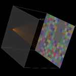
The above image shows traffic flows on a small /24 subnet. The source IP address is represented on the left, and the destination IP addresses are on the right. Each square represents one unique host. The lines indicate traffic flows between source and destination IP addresses. The fan-out from left to right indicates a network scan, which created a flows from a single source host attempting to connect to a large number of hosts in the destination subnet.
For more on Flamingo, see http://flamingo.merit.edu.
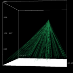
This series of images shows flows originating from a single source IP address going to different destination IP addresses on destination port 445. The traffic indicates suspicious traffic, related with the Zotob series of worms. The figures show flows over a 60 second period.
For more on Flamingo, see http://flamingo.merit.edu.
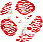
This graph was generated with psad (http://www.cipherdyne.org/psad/) running in --CSV mode against the iptables logfile that is distributed as a part of the Scan34 Honeynet challenge (see http://www.honeynet.org/scans/scan34/). The graph shows 92-byte ICMP type 8 packets directed against the Honeynet subnet 11.11.79.0/24. These packets are most likely associated with the Nachi worm (see http://www.cisco.com/en/US/products/sw/voicesw/ps556/products_security_notice09186a00801b143a.html). Here is the specific command used to add the 92-byte search criteria:
# psad --CSV -m iptablessyslog --CSV-fields "src dst ip_len:92" --CSV-max 300 \
--CSV-regex "PROTO=ICMP.*TYPE=8" | perl afterglow.pl -c color.properties |neato -Tgif -o nachi_worm.gif
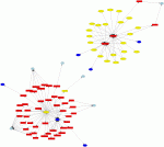
This graph was generated by using psad in --CSV mode against the Honeynet Scan34 challenge iptables logfile (see http://www.honeynet.org/scans/scan34/). This shows outbound traffic from the Honeynet subnet 11.11.79.0/24, and clearly shown are suspicious connections from the host 11.11.79.67 to external SSH and IRC servers; these are good indications that the system has been compromised.
NEXThink is a small Swiss startup which sells a solution in the security/visualization space. They are deploying an agent on the endpoints (machines) and record network activity from them (at least that's whay I understood). The network activity is then visualized with parallel coordinates and starfields.
I was reading a paper about some of the visualization approaches they are taking. To summarize a couple of interesting points from the paper:
The next thing I hope to see from them is that they post some graphs here!