I realized that having a blog and a discussion page is somehow confusing. That's why I moved the blog into the Discussion board. Sorry for the two comments that I had to move and are now posted under my name. I put the author in the first line of the comment though.
I am going to change some more things on the page. Mainly in terms of accessibility and usability of the individual resources. I hope overall the page will get easier to use.
Maybe that's a bit provocative and maybe I am wrong, but let me tell you why I think that the market is not yet ready for security data visualization. If you look at the visualization space, where business intelligence (BI) and other similar technologies reside, you will find that visualization is used in areas where the underlying data is very well understood. For example for sales and marketing data. It is very simple to explain to someone what sales data is all about. People can relate to those pieces of information. They understand it.
Computer security logs are not well understood at all! How do you expect people to understand visualization of security data if nobody really understands the underlying data? What are the best ways to visualize all this data if you cannot even understand the individual textual entries?
What we have to do (and if I say 'we', I mean you guys reading this blog, you guys inerested in this topic), is to go about the problem of log analysis and visualization on a use-case by use-case basis. We cannot solve all the problems at once. Let's be very specific and show for one type of log file, one type of log entries, how they can be visualized and how that helps the user.
I would claim that the companies which have tried to play in the security visualization space have not had much success because they tried (and probably still try) to address the entire problem at once: Visualizing log files. Again, let's go use-case by use-case. Submit them here so people can learn from you and you can learn from others!
This graph combines a heatmap with sparklines showing the utilization of an Unix node over a year. The heatmap reflect the average values within each day, while the sparklines show the intraday trend. While not directly security-oriented, the same combination can be used to show event trends over a large period of time, for example logon events. Can easily be combined with drilldown-functionality for each day or month.
Very cool idea here with this site. Unfortunately I can't see the data in any of the graphs thus far submitted because they are too low resolution. They look cool, and possibly useful -- I'd love to look into them more closely.
Any chance of (much) higher resolution images??
cheers

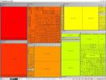
This time we did not use a line graph to visualize a firewall log file, but a treemap. The picture was generated with AfterGlow 2.0. The hierachy used is: Source Address | Target Port | Target Address and the coloring is based on the Source Address.

This graph was generated from a firewall log using AfterGlow. The properties file used was the following:
label.source=0

color.event="blue" if ($fields[1] > 1024)

color.event="lightblue"

color.target="yellow"

color="red3"
This page is meant to help collect parsers for log files. Post a comment with either a link to your parser or past the parser in here if it is not too big.
A new release of AfterGlow, Version 1.5.8, is due soon. A few new functions are included, among them a snort alert file parser. The tool can be downloaded at: http://afterglow.sourceforge.net