

A 3d map of my network with nmap and mysql. We made it by using VRML.
So, the blue color is Windows computer and the red one is linux, the others in yellow are the printers (the eight is the number of the open ports)
It is very easy to compare two different scan (different days or weeks). When the cylinder is blue (microsoft computer) with a black cylinder, it is the different of port between the two scan, there is in this some new ports.
It possible to see it from fornt, up, left, right using vrml player.
:-))

This graph shows the statistical entropy of nine RDP sessions, as observed by net-entropy. There are two notable outliers - at this level of zoom, the black line is the most obvious. This was an RDP session to a server whose encryption level was set to "Low" - the other eight were to servers set to use "Client Compatible" encryption.
A second outlier appears at the beginning of the session (hard to see at this zoom level), and was due to the use of a different RDP client package. Further outliers (not on this graph) were observed when using rdesktop instead of the native Windows RDP client.
A fuller writeup is here.
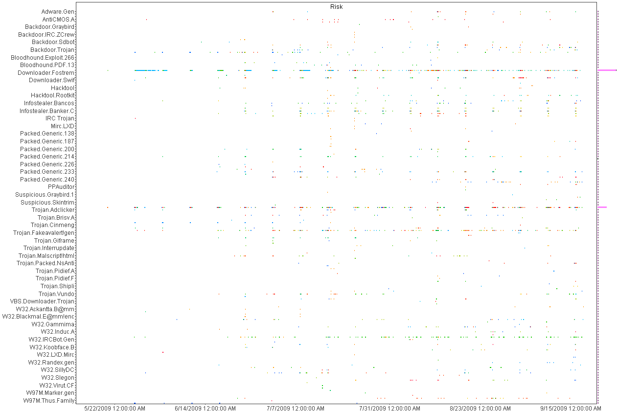
I was culling through the logs on one of my systems the other day and realized that I was getting a fair amount of alerts from my Symantec A/V servers. At first, I was not interested in what malware was being detected and cleaned but it got me thinking about what interesting patterns existed. I suspected that the majority of malware infections were caused by a minority of users as most malware these days require some user action. To test this theory I wrote a simple parser
to convert the logs to something that I could push into a visualizer and started looking for interesting patterns.
Here is a histogram and a heatmap of several months of data.
As announced on the Picviz mailing list, the new GUI is out. This is not a new release of the engine (libpicviz) but the GUI.
There is a lot of new feature that came from the Google summer of code, since Picviz was a project proposed by the Honeynet project. It is mostly about interaction that a graphical interface can give you to deal with parallel coordinates.
You can download it there: http://www.wallinfire.net/files/picviz

Shown is a visual of a time series analysis representing malicious activity reported by our 6 most active and reliable SensorNET honeypots. These honeypots have been deployed for between 9 months and 2 years in the Australian IP space.
For the full analysis, see my blog http://honeynet.org.au/?q=Most_dangerous_time_on_the_Australian_Internet
ben

From blog:
http://honeynet.org.au/?q=time_series_geomapping_of_spam
"In a previous blog, we showed off some heatmaps that were supposed to help answer the question "Where does SPAM come from?". The problem with these maps, is that they are the combination of months of data without any respect to time.
So I set out to show the same information in a video to help answer a broader question "When and Where does SPAM come from?". Each red flash represents a moment in time that a point on the earth sent us some spam.
Without further ado, here is a video of about a week's worth of SPAM on the planet Earth......"
Note, I learnt about the logster tool here on the secviz blog first :)
Watch the vid on the blog, Here is a snapshot picture.
ben

video available at http://www.youtube.com/watch?v=53p0A_3WjgA
whitepaper describing the UI available at http://www.eqnets.com
As promised once I managed to get 2.0 out I would make 1.0 a free download. 2.0 we've added the world map, timeline and organizational data. What was interesting was we started to look for "soft" targets, home users, colleges etc. The places that hackers tend to "train" on...( I know that some colleges and home users are built like fort Knox : )
When we started to use the filters on the timeline, specifically looking for universites it opened up a whole new avenue for exploration. I found a couple of systems with possible "interesting" traffic not detected by my snort, Cisco IPS or symantec software. We're in the process of adding an hourly report. I wanted this to be similar to the hourly wrap conducted by most organizations..ie looking for "strange" traffic (low port to low port, multiple connections to new ip addresses but source port remaining the same etc etc...anything that we would consider "crafted" or maybe unusual.) I think the timeline gives an interesting filter approach to visually looking at the data...we have some other stuff up our sleeve (especially with the timeline...but also about displaying the hourly datasets....I thought about a "virus" like approach with "cells" representing events, but turning darker and mutating if they meet preconditions...i know it sounds strange but in my head it seems to work :) )
you can download the free "lite" version (no timeline, no world map, no organizational data etc but should give you an idea how easy it is to set up)
http://www.manntechcomputersinc.com/Demo_Page.html
and yes we will update the demo page to include the new stuff.....:)

In the snapshot above, the administrator has created a "Top Peers" statistics based on filtered log entries and decided to view the outcome as a Geolocation Map. You can monitor network traffic with the help of Geolocation Maps in real-time too. Here is a video that describes more closely how StoneGate Management Center's Geolocation feature works in practice: http://stoneblog.stonesoft.com/2009/07/smc-videos-geolocations/.
Mainly as a bit of fun, I thought it would be interesting to sort some of our SPAM into distinct groups and make some wordclouds, or more specifically SPAMclouds from the content of the spam.
Attached is the cloud for SPAM attempting to recruit Money Mules.
You can see the Phishing and Advance Fee Fraud (AFF) clouds and the full story here http://honeynet.org.au/?q=spamclouds
ben

I have captured few examples for visualization to show internet distribution of OS X threat. This has been discussed here.

Some time ago F-Secure collected a bunch of log data on about 700 000 botnet IRC channel joins. They then asked us to visualize the joins as a time lapse on a world map using geomapping. The results are available here: https://www.clarifiednetworks.com/Blog/2009-01-01%2018-15.
At the CISSE 2009 conference, we held a workshop on Security Visualization, during which we identified a number of research problems associated with security visualization. You can find them listed below. Tomorrow, we will identify use-cases for security visualization. If you have any use-cases that you want us to consider, comment on here!

This was done using the circos tool. It is a very useful map style, this one shows some location attributes of malware captured by our nepenthes malware sensors at the Australian Honeynet Project.
For full story and maps of other attributes http://honeynet.org.au/?q=node/42
ben
I'm trying to use afterglow 1.5 on a gentoo system and running into an issue that I hope you can help me figure out.
When I read a dump file into tcpdump2csv.pl, using the switches documented, I get absolutely no output. If I turn on debug, I get my tcpdump lines, preceded by "ERROR:" as below:
ERROR: 2009-05-04 18:37:28.332949 In ethertype IPv4 (0x0800), length 93: (tos 0x0, ttl 61, id 0, offset 0, flags [DF], proto UDP (17), length 77)
ERROR: 74.63.208.3.53 > 216.245.196.14.56383: 14710 1/0/0 mail.lab.spb.ru. A 77.234.201.82 (49)
If I run with tcpdump -ttnnlr, I get a little closer to the lines in your documentation, in that the timestamp is on the same line as the capture info:
ERROR: 1241462458.413252 In ethertype IPv4 (0x0800), length 93: 74.63.208.3.53 > 216.245.196.14.43954: 7712 1/0/0 A 195.128.50.36 (49)
There is no description of what the error is, and still no CSV output is appearing.
If it makes a difference, I am running with tcpdump 4.0. If I can add an ebuild for afterglow 2.0 for the gentoo world, I will give that a try and see if I get a little further.


