I just uploaded a number of my old presentations, mainly on security visualization, to slideshare. The link below leads you right to them:
Security Visualization Presentations
There are presentations from a number of conferences:
And then there are still the newer presentations that have been there for a while now.
I teach a data analytics and visualization class every now and then. In the last section of the class I share a number of resources with the students. The Web sites are mainly blogs and generic visualization resources; Not tools.
The following is the list of resources. Have your own favorite visualization resource? Add a comment!
A much longer list of non curated links you can also find on my delicious feed.
AfterGlow now enables Splunk 4.2.x to generate link graphs!
One of the very first Splunk Applications was the AfterGlow for Splunk Addon. Initially it was just a simple search command but then with version 4 of Splunk, the application matured to a full blown Splunk App. Unfortunately, with the introduction of Splunk 4.1 and 4.2, the application got broken. As of earlier this month, however, AfterGlow for Splunk has been fixed and now works with Splunk 4.2.x.
Post your visualizations here in the secviz gallery!
I wrote a new blog entry talking about the maturity scale of visual analytics. The visualization maturity scale can be used to explain a number of issues in the visual analytics space. For example, why aren’t companies leveraging visualization to analyze their data? What are the requirements to implement visual analytics services? Or why don’t we have more visual analytics products?
Unfortunately, we do no have mature visual analytics products yet that really encompass all of the steps in the maturity scale to deliver a great experience to the end user.
Also check out the Maturity Scale for Log Management and Analysis to have a closer look at how log analysis and management play into the visual analytics process.

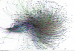
This image is a Gelphi generated undirected graph showing the EXPORT header entries from windows 7 DLL's and other DLL's. You can find the Python code used to generate it and high resolution imagine here on my blog http://cybersecpaul.blogspot.com
The "Attack Visualization" challenge from the HoneyNet Project has been extended until January 22nd 2012!
Happy Visualization!
You might have noticed that there was quite a bit of SPAM posted to secviz.org lately. No, we haven't been hacked. But we got spammed. The SPAM module I had installed is not the best, so unfortunately, a bunch of spam made it through.
No more! I changed the model of how content can be added to secviz.org. All content is now moderated! I am usually pretty quick with approving content, so it shouldn't be a big impact!
Looking forward to seeing a lot of your new content in my moderation queue!
-Your Admin
Forensic Challenge 10 - "Attack Visualization"
Challenge 10 - Attack Visualization (provided by Ben Reardon from Australia Chapter)
Please submit your solution by December 18th 2011 at http://www.honeynet.org/challenge2010.
Results will be announced on 2012, January 31th. For any questions and inquiries, please contact forensicchallenge2010@honeynet.org.
Skill Level: Intermediate
Forensic Challenge 10 takes us back in time, to revisit one of last year’s popular Forensic Challenges (FC5). Although this time around, the goal is to create a visual representation of the attack.
There are no right or wrong answers here, and we are keen to see what can create! If you are constrained by any guidelines, or have ideas that are “out of the box” – that’s fine, we want you to use your imagination and have fun.
The Challenge:
Design and build a visualization that describes the attacks that were analyzed in FC5. Use the three prize winners’ solutions as references and to give you a head start on the data analysis. Use the FC5 dataset to create your FC10 visualization.
As an example, the visualization may have a geographic element, represented as a map, link graphs, histogram, or parallel coordinates, that sheds light on the following:
Where the attacks came from
The volumes of attacks originating from various locations
The success or failure of these attacks
The nature of the attacks. For example which are “primary” and which are the “secondary” phases.
Can the attacks be color coded to describe groups of attacks/attackers?
Use external data sources such as the many freely available geomapping databases.
The output can be anything that you like - from a still image, to interactive flash/java, dynamically updating, dashboard style, magazine infographic, holograms are also accepted.
Judging:
Because data visualization is a very subjective topic, we will have a panel of 3 Honeynet members to judge entries. These panel members have an active interest in the data visualization field in the Honeynet Project. Keep in mind though, the nature of this challenge is not really to find a “winner”, but rather to inspire newcomers into the data visualization field within cybersecurity. If you know anyone who is not in security field , but may enjoy being part of this challenge, please forward this to them – we’d love to get some submissions from people outside the security field.
Points:
The minimum question set that the visualization should address is:
Where do attacks come from? (10 points)
What is the most prolific attack? (5 points)
Which attacks were successful and which failed ? (5 points)
What assumptions were made and what was the reasoning? Don't be afraid to make assumptions! (5 points)
What are the limitations of the visualization? (5 points)
How could you improve the visualization if given more time and resources - e.g. on a future GSOC project? (2 points)
Provide a description of the toolsets and scripts used (10 points)
Bonus points:
Aesthetic appeal and ability to hold the subject's attention (5 points)
Interactivity , eg the ability to drill down, explore, or zoom in on events. (10 points)
Animation, particularly based on a timeline. (10 points)
Creating a visualization which uncovers any trends, observations or artifacts which were not described in the FC5 prize winning solutions. (20 points)
Creating a visualization that tells a story about the data set, threat environment, and the attack. (20 points)
Sources of info:
Hint: take some time and look around for inspiration in data visualization of fields outside of cyber security. Consider how you might apply some of the same concepts and ideas to this dataset.
http://flowingdata.com
http://infosthetics.com
http://datavisualization.ch
http://www.secviz.org
http://www.maxmind.com
http://www.vizsec.org
http://afterglow.sf.net
And of course our recent Google Summer of Code projects:
Honeyviz
Webviz

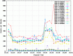
Most tools/charts only display the Total amount of particular IDs (the most common is a pie chart).
This is difficult when you want to know the behavior of such IDs over time. So I came up with this :D
I've created a small set of scripts that takes the Top-Syslog-IDs from Cisco ASA Logs for plot them a line chart.
The "Top-Syslog-IDs" represents the IDs with more entries in the logs in the last N minutes.
This particular graphic shows the top 15 syslog IDs in the last 30 minutes.
Tools: bash, sqlite3 (for storing time + ids), Gnuplot

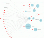
This is an example of OSSEC alerts visualization. Alerts are extracted from the OSSEC database using a Perl script and parsed by Afterglow.
More details here: http://blog.rootshell.be/2011/10/24/mapping-ossec-alerts-with-afterglow/
“A picture is worth a thousand words.” We have all heard that proverb before, and as security professionals, we see examples of this through the charts, graphs and maps we use on a daily basis. RSA, the Security Division of EMC, is currently conducting a study to gain perspective on how security professionals interact with data visualizations. We invite you to participate in our survey.
Hi
I am a final year undergrad student studying computing and information security. I am about to embark on my final year project, for which I have decided to try and create a network monitoring tool that visualizes the logs of the network traffic. I would like to point out that this is still a very young project but would like to ask for any pointers or advice.
I am currently thinking that I will build a piece of software in something like pearl that will call and run tcp dump from a server on the network. This will then log all entries to a data base or I i can read from p cap file s into a script which will help to display the data on a web interface from a host on the network..
have a lot to learn but some points in the correct direction would be great... like is pearl best to use should I dump everything into a data base or will it fall over if i chuck loads of data at it etc ...
your help is much appreciated
During the last security incident that I worked on, I needed to grind through 20gb of log files looking for any odd log lines that would indicate the point where the bad guys got in. If I had done it manually, I would still be looking at log data. Instead, I built a tool that converted logs into pattern templates and looked for templates that I had never seen before. This allowed me to zero in on just a few hundred log lines out of all the data.
Templater is a small and fast log processor that provides simple artificial ignorance capabilities. You use the tool to process past log data and store templates that represent normal log line structures. You then run the tool against current or target logs and all normal patterns are automatically ignored. The parser is fast and capable of processing millions of lines per minute. For weblogs and firewall logs, I average 9M lines per minute on a 2GHz x86 machine running *NIX. The template strategy was originally proposed by a friend of mine in 2003 who later built a tool called never before seen (NBS) which also provides artificial ignorance for arbitrary text data as well as text structures.
I am optimizing and testing a new QtWidget I have created for force directed graph layouts. Currently it will only utilize the CPU but I am working on a CUDA implementation as well. When release the widget will allow developers to place force directed graph layouts in their qt applications. Additionally this will be included in a new version of inav hopefully out soon. More images on my flickr page:
http://www.flickr.com/photos/scap1784/sets/72157627651310826/with/6168147922/