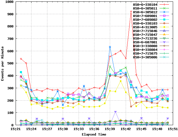
Most tools/charts only display the Total amount of particular IDs (the most common is a pie chart).
This is difficult when you want to know the behavior of such IDs over time. So I came up with this :D
I've created a small set of scripts that takes the Top-Syslog-IDs from Cisco ASA Logs for plot them a line chart.
The "Top-Syslog-IDs" represents the IDs with more entries in the logs in the last N minutes.
This particular graphic shows the top 15 syslog IDs in the last 30 minutes.
Tools: bash, sqlite3 (for storing time + ids), Gnuplot

