Discussion Entries

warning: Creating default object from empty value in /usr/www/users/zrlram/secviz/modules/taxonomy/taxonomy.module on line 1387.

Visualisation hardware & software

This is a snippet of a report written for an honours project I'm doing on security visualisation. Just some ideas I want to punt out there, cause it'd be nice to see them take off, & in case they've gone un-noticed because of their being in different topic areas,

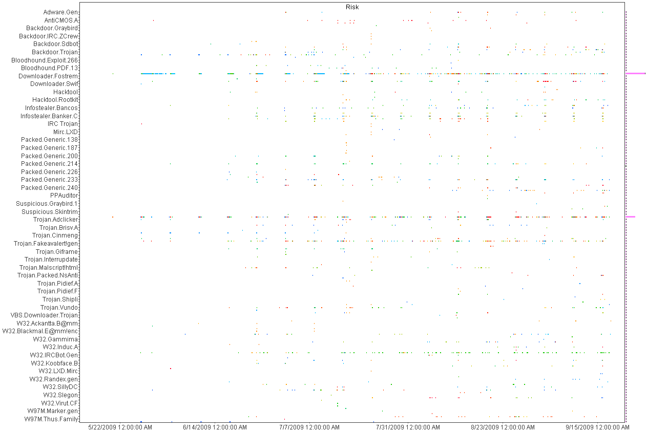
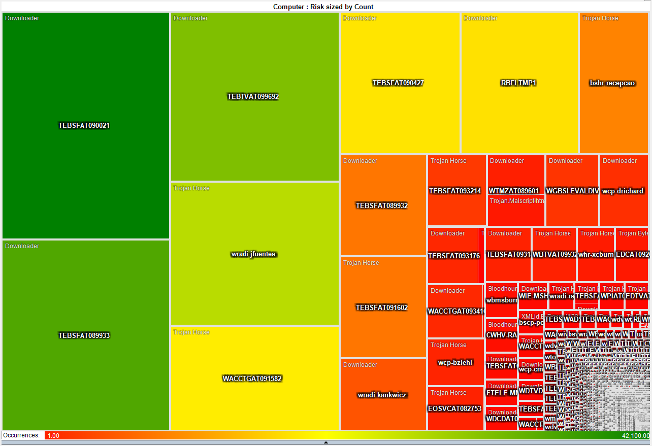
Visualisation software for security can be used to display graphical information about the data being captured in real-time and also used for offline analysis. The difference between visualisation applications and the monitoring software of the previous objective is in the presentation of the data, although both kinds can and do make use of the more familiar graphs, such as line graphs, bar charts, pie charts, flow charts.
In general, information visualisation is a way to gain insight into complex datasets and textual information in a condensed and understandable way.
Consequently, evaluating a tools effectiveness means taking into account multidisciplinary areas knowledge of visual systems. Successful visualisation tools take into account user interface design, human-computer interaction, psychology of human perception, machine pattern recognition, and are as much borne from certainly the design side of art as they are about presenting quantified data.
To some extents this kind of information visualisation is quite new, and at its current stage is itself viewable as an overall discipline at a time before its emergence as a distinct discipline; but at the same time the areas that will feature heavily in its development are burgeoning in somewhat unnoticeable ways. For example, the prevalence of touchscreen mobile communications devices, whose interfaces are so intuitive and easy to pick up that many people only need a general idea – like another graphic that shows them in use – of how the interface works to be able to use it correctly. It feels natural enough to be able to press buttons with symbolic and pictorial representations of functions, go to the next page using a sweeping motion, zoom in and out to gain more precise datasets or larger overviews using hardware or onscreen rollbars and sliders, manipulating the onscreen display by tilting the device itself; the world wide web itself was designed from the outset as a distributed hypertext system. This sounds obvious as it is well known what the H in HTML stands for, but the framework itself is another example of a new idea (though clearly built upon cross-indexing, as used in libraries) that people find easy to accept without really noticing it – the amount of extra data conveyed within a document using an tag, navigation made easier with anchors, the hypertext links themselves that allow keywords when activated by a button click to jump to another document with further information in relation to the keyword, the use of tabbed graphical browsers – these web basics are so integrated to the user precisely because they use intuitive design interfaces.
The same ease of information access is also behind why it is so frustrating for the user to have the desktop or interface become slowed down and cluttered with unwanted elements, which aside from being relevant to the overall objectives of this project (as spam and other malware and adware are certainly cumbersome additions to any user experience) give very good design tips of what to include and not include in a graphical console.

To some extents the development of information visualisation has been impeded because the hardware is either too expensive, spacious, or simply not available yet, therefore not able to keep up with the code requirements of the applications or the amount of data needing to be accessed, sorted through, processed. As previously mentioned, clustering is definitely a viable solution to many of the problems slowing down development. Parallel computing and information visualisation station design are very complimentary, as the latter greatly benefits from incorporating the former; this is easily understood by merely counting the amount of nodes being monitored in a given network, and considering that the monitoring station has to capture, make sense of (to various degrees), and possibly interpret and present, and certainly store or produce hard copies in realtime, for all of the nodes combined.
Video game hardware and onscreen interfaces, and music visualisers, are another two areas where a lot of progress has already been made that can be directly lifted and incorporated into information visualisation.

Like lightpens and graphics tablets used for a long time in artistic and photo editing digital applications, devices that offer remote pointing that manipulates onscreen elements are very useful to someone sat far back from multiple monitors, as the interaction is required but their field of vision has to be able to take in all the displays.
There are other existing solutions here also, particularly in the field of wearables, such as being able to fit large display formats inside regular sized glasses, and using one-handed small footprint keypad controllers.
Again, other existing areas have already taken multifunction keypad concepts onboard – gaming and video editing decks being prime examples. These allow complex functions to be executed with a key press, by assigning the desired functions as hotkey shortcuts.
Onscreen GUI menus in games offer the user at-a-glance statistics and information as well as easy access to point-of-view changes, and commonly offer the same information on teammates and enemies – it can be seen how this can be utilised in realtime security monitoring, to track multiple connections and see data on them continually updated, monitor a collegues progress, and shift between emphasis on varying datasets without having to minimise or close any displays.
Online and network gaming network configurations themselves have to deal with multiple users changing the game elements on a constant basis, and be able to update the changes and present them to all users in a synchronised way, so everyone is interacting with the same scenario. This is for now more successful in some places than others, purely because of latencies and the haphazard manner that packets may traverse the internet, and also of course based on the users own hardware and the features offered by their ISP and the associated telecoms infrastructures. However the framework itself is available and in a LAN environment can be demonstrated to work very well.
Graphics cards have also developed greatly in recent years, to the extent that what would have required a dedicated visualisation station can now be done on a home PC with one to four graphics cards. GPU and CPU hybrid systems are already in the Top 500 Supercomputer listings and the main hardware chip vendors are or have already been focusing a lot of attention on GPU development.
Music visualiser applications can also be adapted to instead of matching the visuals to audio events, to match them to network or other data events. This is a very promising area as baselining can be used to produce a backgrounded pattern or visual of the networks behaviour, and therefore any fluctuations are readily noticeable even to someone knowing nothing about network data itself.
Use of colour and shading types is also very relevant, and comes out of areas like topography. Many current security and network visualisation tools allow the user to alter colouring of data elements to suit themselves; this is another important consideration of a user interface and from a security point of view is a welcome feature, as user view customisation makes it potentially less obvious to an intruder what the data represents. Of course in collating and sharing data between the authorised users, means there has to be a means to easily combine differing views, which can be done with mapping and parsing.

REQUEST for Hilbert Curves

I was just looking for some examples of IPv4 Hilbert Curves and realized there were non in the image gallery. Does anyone have examples of IPv4 space visualizations of that sort? They are also called IPv4 Heatmaps. I have never generated any of them myself and didn't just want to post a screenshot of someone else's images.
Anyone?

Free Conference Pass to FOSE

FOSE is a conference focused around Technology Solutions for the Business of Government. The FOSE conference donated a free conference pass for the secviz readers. In order to get the pass, tweet the following:

@secviz is raffling off a ticket to the FOSE conference, which is taking part March 23-25, 2010. Retweet to be part of the raffle. See http://secviz.org for details. #FOSETix

UPDATE: We have a winner: @fifth_sentinel ! Congrats!

The winner will be the tweeter that tweeted exactly at the position in the middle of all tweets. So, if there were 20 tweets, the 10th tweeter (we'll round down for odd numbers).

Here is a word from the sponsor:


Explore targeted technology areas, educational theaters, and thousands of cutting edge products. Plus, network with a wealth of industry experts.

You are well aware of the challenges we as a CyberSecurity community face from rapid changes in the technology landscape. FOSE 2010 is the place to discover opportunities and solutions along with changing expectations for government IT professionals.

Register today for the FOSE 2010 experience http://www.fose.com.

You can expect:

- 3 days of IT resources helping you navigate today's shifting tech landscape
- 2 full conference days packed with education on emerging technologies, trends, and new improvements to existing solutions
- Thousands of products on the FREE* EXPO floor allowing you to gain one-on-one insight into the capabilities of our exhibitors through demos, theater presentations and FREE Education.
- Attend the Accenture CyberSecurity Pavilion or Focus on Digital Forensics.

*FOSE is a must-attend free show for government, military, and government contractors.

SOI 2.1 Cisco IPS view

I've tried to add a new visualization for the cisco part of the upcomig (very very soon) of the 2.1 release of soi. Tell me what you think , im still tweaking it so this is a rough view...I'll still keep the map, timeline matrix etc for the pix but just wanted to add a different view for it...(oh and the colors will be more "pastel"....:) )

VizSec 2010 - International Symposium on Visualization for Cyber Security

International Symposium on Visualization for Cyber Security (VizSec)
14 Sept 2010
Ottawa Canada
Co-Located the Internat’l Symposium on Recent Advances in Intrusion Detection
http://www.vizsec2010.org/

The International Symposium on Visualization for Cyber Security (VizSec) brings together researchers and practitioners in information visualization to provide opportunities for the two communities to collaborate and share insights about meeting security needs through visualization approaches.
VizSec 2010 will be held on September 14th in Ottawa, Canada and is co-located with 11th International Symposium on Recent Advances in Intrusion Detection (RAID). This year our focus is on understanding what makes effective visual interfaces for different cyber security tasks.

Papers offering novel contributions in security visualization are solicited. Papers may present techniques, applications, practical experience, theory, or experiments and evaluations. Papers are encouraged on technologies and methods that have been demonstrated to be useful for improving information systems security and that address lessons from actual application.

Information regarding submission dates will be available on the website.

AfterGlow

Hi , im an apprentice to Sec Viz technology.
I used Afterglow to do some visualizing. i need to know how to do aggregation in that.Though I used the coding in Raffy's book, I couldn't make it. I am using the DAVIX and it's sample.properties file.The code that I have used was

color=”yellow” if (field() =~ /ˆ111\.222\..*/);
color.event=”green” if ($fields[1]<1024)
color.sourcetarget="blue"
cluster.target=regex_replace("(\\d\+)\\.\\d+")."/8"
if ($fields[1] eq "80")

Is this Ok? I don't get a different output .Pls let me know where have i gone wrong...

Cheers!!!
SmP.

Treemaps for Windows firewall log

Does anyone have a parser for using Windows firewall logs with Treemap???

Augmented Reality - The next step in security Visualization

We've been playing around with augmented reality for a time now, the technology seems to be on a tipping point with iphone (not just the overlay - not truly AR, but they do have true AR apps) , android and other forms of capture and processing. To me this is the future of security visualization. I know it is a bold statement to make, but when you start to develop and delve deeper the possiblilities are endless. If you look at my site you will see the direction of our research. ( http://www.manntechcomputersinc.com/Researching_Now.html ) Im going to release a video asap of where we are with our AR. I think the subject of security AR is too important to completely commercialize. With that respect any "breakthrough's" that we are having will be made open source. If some of you are new to the AR scene there is a good open source tool called artoolkit. Google it and you will see it doesn't take an hour to start playing and testing with AR. For those of you interested please drop me a line at darrenmanners@manntechcomputersinc.com.

Windows login logging on the cheap

This tool walks the line of being a parser but it is a pretty handy way of converting Windows logins to something useful to graph. Put this in your login scripts and point it at your syslog infrastructure and you get all the gory details about windows who is logging into what system and the IP/NETBIOSNAME/MAC of the system is in a single log line.

LogReporter.c

Sphere of Influence 2.1 - upcoming release

Im just about to launch 2.1 version of Sphere Of Influence. I have added a summary page. Here I took a typical 800X600 window and made each pixel represent appx 164 ports. I wanted to visualize the entire port spectrum so that an anaylist can drill down on spotted patterns. I have included a screenshot of the new window...in this shot you can see some peer to peer activity at work. The new version will also have a "hourly wrap up" summary which is pretty extensive in its details, also I added a world map for snort. It should be launched in the next few weeks. Remember this is free for state, federal and educational establishments (worldwide)..companies have to pay, but for $89 I think you get a bargain. Im also working on a very cool project for VOIP systems.....stay tuned
www.manntechcomputersinc.com

Happy Hunting

Darren

Note: I have a new video out on youtube (http://www.youtube.com/watch?v=ekOXjrF9enI) that you can see the new visuals....release is very soon!!! (and we added the Cisco IPS into the mix as well)

Symantec A/V log parser

I was culling through the logs on one of my systems the other day and realized that I was getting a fair amount of alerts from my Symantec A/V servers. At first, I was not interested in what malware was being detected and cleaned but it got me thinking about what interesting patterns existed. I suspected that the majority of malware infections were caused by a minority of users as most malware these days require some user action. To test this theory I wrote a simple parser
to convert the logs to something that I could push into a visualizer and started looking for interesting patterns.

Here is a histogram and a heatmap of several months of data.

Picviz GUI 0.7 is out!

As announced on the Picviz mailing list, the new GUI is out. This is not a new release of the engine (libpicviz) but the GUI.

There is a lot of new feature that came from the Google summer of code, since Picviz was a project proposed by the Honeynet project. It is mostly about interaction that a graphical interface can give you to deal with parallel coordinates.

You can download it there: http://www.wallinfire.net/files/picviz

Sphere Of Influence 2.0

As promised once I managed to get 2.0 out I would make 1.0 a free download. 2.0 we've added the world map, timeline and organizational data. What was interesting was we started to look for "soft" targets, home users, colleges etc. The places that hackers tend to "train" on...( I know that some colleges and home users are built like fort Knox : )
When we started to use the filters on the timeline, specifically looking for universites it opened up a whole new avenue for exploration. I found a couple of systems with possible "interesting" traffic not detected by my snort, Cisco IPS or symantec software. We're in the process of adding an hourly report. I wanted this to be similar to the hourly wrap conducted by most organizations..ie looking for "strange" traffic (low port to low port, multiple connections to new ip addresses but source port remaining the same etc etc...anything that we would consider "crafted" or maybe unusual.) I think the timeline gives an interesting filter approach to visually looking at the data...we have some other stuff up our sleeve (especially with the timeline...but also about displaying the hourly datasets....I thought about a "virus" like approach with "cells" representing events, but turning darker and mutating if they meet preconditions...i know it sounds strange but in my head it seems to work :) )

you can download the free "lite" version (no timeline, no world map, no organizational data etc but should give you an idea how easy it is to set up)

http://www.manntechcomputersinc.com/Demo_Page.html

and yes we will update the demo page to include the new stuff.....:)

Money Mule, Phishing and AFF SPAMclouds

Mainly as a bit of fun, I thought it would be interesting to sort some of our SPAM into distinct groups and make some wordclouds, or more specifically SPAMclouds from the content of the spam.
Attached is the cloud for SPAM attempting to recruit Money Mules.

You can see the Phishing and Advance Fee Fraud (AFF) clouds and the full story here http://honeynet.org.au/?q=spamclouds

ben

CISSE Working Group Outcomes - Security Visualization Challenges

At the CISSE 2009 conference, we held a workshop on Security Visualization, during which we identified a number of research problems associated with security visualization. You can find them listed below. Tomorrow, we will identify use-cases for security visualization. If you have any use-cases that you want us to consider, comment on here!

Security Visualization Research Problems


Important Realization: Visualization is generally an add-on to a specific problem or task. This dilutes the research community, since there are data visualizations of many different areas of interest.

Data Acquisition

  • Data normalization: aggregation, filter, and augmentation. Common formats are needed that span the requirements.

  • Accessing data (transport problems)

  • Data security issues (confidentiality, integrity)

  • Context collection

  • Real-time processing (collection and visualization)

  • Data disposal / destruction

  • What to do with missing data / gaps?

  • “Cleaning” data

Visual Representations

  • Time series representations instead of snap-shots

  • Are three-dimensional / interactive visualizations more intuitive / easier to use than, for example, a set of two dimensional representations?
  • Education of Expert Witnesses: how to present scientific data and explain visualizations in terms that are understandable by juries, prosecutors, and judges

  • The challenge of transitioning data into evidence is an on-going problem. The starting point is raw data, which is then transformed into a visual representation, which is then contextually interpreted as information. There are many issues with this process, including appropriate representation of actual or relational time sequence and the provability of the linkage between the raw data and the interpreted information.

  • Photo classification: A challenge is the emerging area of photo-realistic cartoons or imagined figures, which are getting so life-like that they are crossing the boundary from good to evil when used inappropriately.

  • Extremely large data set analyses, focusing on making them faster while maintaining accuracy

  • Integration of many variables into a useful visualization, where many means 4 or more variables.

Visual Interpretations

  • “Bridging the Gap”: creating visualizations that are intuitively interpretable by non-trained people. This implies needed integration of knowledge from the fields of sociology, cultural anthropology, learning theory, neuroscience, psychology, disability amelioration, etc.

  • Understanding visual representations: interpreting actual meaning from the visualization can be challenging. Research into how to make this more intuitive is needed, as is research in how to best educate analysts. Additionally, better human-interpretable visualizations are needed.

  • Visualization as an accelerator of identification of anomaly judgment (OK versus Not OK)

  • Interpretative visualization tools

  • Enable a better interpretation of complexities in relationships and interactions in data sets.

Overall Problems

  • Scientific validation of tools (Type 1 and Type 2 error rates; perhaps tool certification as being built with “pure” software, perhaps Common Criteria type certification)

  • Need to create an inter-disciplinary community of visualization researchers that talk to each other and share methods so that the wheel does not need to re-invented between communities

help debugging tcpdump2csv.pl?

I'm trying to use afterglow 1.5 on a gentoo system and running into an issue that I hope you can help me figure out.
When I read a dump file into tcpdump2csv.pl, using the switches documented, I get absolutely no output. If I turn on debug, I get my tcpdump lines, preceded by "ERROR:" as below:
ERROR: 2009-05-04 18:37:28.332949 In ethertype IPv4 (0x0800), length 93: (tos 0x0, ttl 61, id 0, offset 0, flags [DF], proto UDP (17), length 77)
ERROR: 74.63.208.3.53 > 216.245.196.14.56383: 14710 1/0/0 mail.lab.spb.ru. A 77.234.201.82 (49)
If I run with tcpdump -ttnnlr, I get a little closer to the lines in your documentation, in that the timestamp is on the same line as the capture info:
ERROR: 1241462458.413252 In ethertype IPv4 (0x0800), length 93: 74.63.208.3.53 > 216.245.196.14.43954: 7712 1/0/0 A 195.128.50.36 (49)

There is no description of what the error is, and still no CSV output is appearing.
If it makes a difference, I am running with tcpdump 4.0. If I can add an ebuild for afterglow 2.0 for the gentoo world, I will give that a try and see if I get a little further.

VizSec 2009 - submission deadline approaching

The 6th International Workshop on Visualization for Cyber Security (VizSec) will be held October 11, 2009 in Atlantic City, NJ, USA in conjunction with VisWeek 2009.

The deadline for full papers (12 pages) is May 8, 2009. The deadline for short papers (6 pages) is May 22, 2009.

Please see the web site for formatting instructions, templates and information on how to submit your paper.

http://vizsec.org/vizsec2009/

Best,
-john

Sphere Of Influence

Take a look at my site www.manntechcomputersinc.com We have developed a visualization tool for pix/asa and snort. It maps ip to geographical locations countries (source or destination), anonymous proxies , sat providers, regions etc. We repsent countries by flags and provide users to add their own icons. I'd be interested to hear what people think....

Conficker.C UDP P2P Traffic

The chart represent several hours of conficker's P2P Udp activity, it relates destination address with dest UDP used.

conficker.c - ccTLD attractor

This is my smart analysis about the first 20days of April 2009 ccTLD (country code top level domain) generated by the algorithm used by worm for pseudo random domain name generation.
The following chart show the frequency for each ccTLD. As you can see there is a sort of attractor for some ccTLD such as AG, BO, LC, HN, PE, and TW. A singular point is for DJ ccTLD domain. For more information http://extraexploit.blogspot.com. This kind of analysis I think that is usefull for get evidence as indicator of conficker.c activities inside your corporate network.

Feedback are well come.

Regards