Discussion Entries

warning: Creating default object from empty value in /usr/www/users/zrlram/secviz/modules/taxonomy/taxonomy.module on line 1387.

More SPAM

The past couple of months have been pretty clean from SPAM in the secviz feed, after I implemented a moderator queue for all the content. This seems to work pretty well. However, the system doesn't let me enable a moderator queue for images in the image gallery. That's why you have seen a few SPAM images in the feed (for example this morning).
I took another step to prevent this. When signing up as a user, you will have to be approved from now on. This seems to be the only way for me to prevent SPAM once and for all. I hope I'll be able to distinguish real users from spammers upon signup. I'll figure that one out.

Looking forward to seeing your posts here!

AfterGlow Cloud: Second release

AfterGlow cloud has evolved further into another release; with many improvements added to the initial version. With GSoC 2012 approaching an end, we've covered all the additional features we planned for in the second phase of development, post mid-term. Building up on the initial version, this post will run you through the general features and additional improvements covered.

A live demo of this release can be found here: http://andromeda.ayrus.net:8080/

Data sources: In addition to the initial method of uploading AfterGlow compatible CSV file, the application now supports two new methods of visualizing your data. You can now upload your logs straight from the source and have it parsed (to a CSV file) and then, rendered on the fly. Additionally, AfterGlow Cloud is now integrated with Loggly.com's API. Loggly is a service which is used collect log data for monitoring and analyzing the data. With an account at Loggly, you can now search and import your logs straight from Loggly and have it visualized. Your authorization to the application to access your account at Loggly remains on our end for about a hundred days, beyond which you'll have to re-authenticate the application again. You can however revoke access to the application anytime. Both of these new additions, require you to specify a parsing scheme which is covered below.

Log parsing: Logs you upload directly or from your Loggly account have to be parsed initially for them to be visualized later. For this to happen, a regular expression has to be provided which groups two or three columns of data (if you're using two columns you'll have to check "Two Node Mode") from each line in your log. You can either specify a custom expression or select one the 'predefined' expressions. While provided a a custom regular
expression to parse your log, you're given an opt-in choice to save your expression as 'Predefined' for other users to use.

Settings tab: These define general settings over the way you want your final graph to be rendered. For example, "Print Node Count" prints the frequency at which each node occurs in the data uploaded beside the node's label while, "Text Label Colour" lets you choose the colour of text on each node. Each field on the application throughout is appended with a "?" help link. Hovering over this link, will provide you a small tip as to what they're supposed to do.

Advanced settings tab: These settings go a little beyond the general settings. As examples, "Soruce fan out threshold" will give a lower limit on the number of edges originating from each source node. If one or more source nodes don't have the required (threshold) number of edges originating from them, they're omitted on the graph. Same idea applies to "Omit threshold for each node" but with the threshold presiding over the frequency at which each node occurs throughout the data.

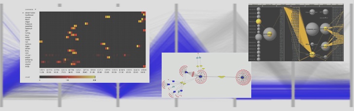
Configurations tab: These settings fine-tune your graph and often bring about interesting patterns, useful for visualization. Each fieldset in this tab provide a way to identify properties across the nodes in the graph. Examples: Option 'port' in clustering provides a way to cluster all the nodes with a specific bound for the port they represent. Giving a value of "2000" would mark and cluster (group) all the nodes representing a port higher than 2000 together. 'Number of occurrences' in Size fieldset, will have the size of each node proportionate to the frequency at which they appear throughout the log. A node with a heavy frequency would appear thick and vice-versa. This helps you to notice interesting patterns. If you're very familiar with the way configurations work with AfterGlow you also have the option of specifying these manually using the "Manual" option. You can simply cut/paste from a configuration file or write your configuration file by hand in a textbox. AfterGlow Cloud also saves your configuration every time you render a graph. When you choose to render a graph again, you can simply use your 'last used configuration' and it'd import the same configuration file you used last time. Alternatively, you can 'import' the last used configuration into the manual mode and further fine-tune it manually.

Rendering Engines: The application now supports using dot/sfdp in addition to using neato using GraphViz. More information about these, if you're unsure can be found here.

Gallery: You can submit the graphs you render using the application to a public gallery (with some details of it) for other users to view.

As an example (a very rudimentary example actually), here's how you might parse a typical Apache log. For this example we'll be using a very small portion of the log (attached), parse the client IP and the size of the request from it and try to render it.

We first point to the demo access log file from Apache and since we're uploading a log directory from our source, we'll have to select the "Log" option to have it parsed to a CSV (compatible with AfterGlow) and then render it. We've also checked the "Two node mode" box since, we'll be only extracting two columns (IP/Size) from our data. For the parser, we use a predefined regular expression which extracts the client IP and request size from an Apache log using the Common Log Format:

On the settings end, for some eye-candyness we define an edge length of 1.5 (length of an edge between two nodes) and define the text label colour as white:

Finally, on the configurations end, we add three colour configuration settings. All source node (Client IP) will be coloured with a shade of green. Target nodes (size nodes with a value of more than 2000 -- in this context it converts to more than 2000 bytes) will be coloured red. All the other target nodes will be coloured with a shade of orange. It's important to note here that configurations are read line-by-line hence, the line ordering matters. This type of configuration will show a really simple relation between how many bytes each client has requested in each request, but it will specifically mark the request with more than 2000 bytes in red (say you wanted to visualize the 'heavy' requests):

The resulting graph from these settings looks like:

You can see from the (really simple) example above some of the 'heavy' (we're classifying 'heavy' as >2000 bytes for the sake of an example here) requests from different clients.

From the development perspective, AfterGlow Cloud can now be deployed to a production like environment. The application (and the demo above) README cater to deploying the application on Apache using mod_wsgi. If you wish to run your own instance of the application, you can clone the source from the repository. A detailed README (pertaining to a machine running Ubuntu) is also available to help you setup. The README walks through the complete steps required from scratch to set the environment and the application (to the point that you can get it running on a fresh Ubuntu install without a hassle). The codebase has also been documented in detail, should you wish to fork and play with it.

This release marks the next version of AfterGlow Cloud. Please report any bugs or comments you have using the contact form on the demo :)

AfterGlow Cloud: Initial release

With the marking of the mid-term milestone in GSoC 2012, we're happy to announce a first version release of AfterGlow Cloud. After a lot of discussions and review the project seems to be in a good position for an initial release. The project in essential is based on AfterGlow [1], a security visualization tool which facilitates generating visual graphs from data you upload. The tool described at [1] is originally command-line based, the aim of this project, in general is to bring this tool and its options to the cloud -- so as to provide a neat interface for on-the-fly visualizations.

Live demos of the project are currently available at:

This release covers all the basic features discussed and agreed upon initially [2]. You can upload any comma-seperated file (only CSV files) as your log source to visualize it. The current version doesn't cover parsers for exporting logs from different sources (example tcpdump) into CSV -- but this is a future addition, likely in the next release. To have a feel of what the application is capable of, you can try uploading the sample "firewall.csv" file (in the attachments). This sample file contains some rules (pass, block) over different source and destination nodes. Getting any sense of what's exactly going on is difficult by merely inspecting the CSV file -- this is where AfterGlow is needed.

Labels "Settings" and "Advanced Settings" cover some rendering settings you might want to choose or override for better customization. For example, "Print Node Count" would append the number of times each source/destination node occurs in the log file provided -- this gives a sense of the frequency of the nodes. Similarly, "Text Label Colour" provides the option to override the default black colour of text on the graph (You can hover over the "?" next to any input for a description of what they exactly mean).

Configurations are used to further scrutinize the rendering of the graph, for example you might want to colour a set of source/destination nodes "red" if their IP is '68.xx.xx.xx'. Each of these configuration lines bring about several layers of visualization. For example, you'd probably want the 'size' of the node on the graph to be proportionate to the frequency they appear throughout the log (configuration under 'Node Sizes' - 'Predefined - Number of Occurrences'). You can remove or change the ordering (ordering of configurations matter) once a line is added. A detailed guide to the different configuration options available, would be added later.

A sample configuration file is added as an attachment (sample.properties). If you'd like to try this out with the sample "firewall.csv" data file, you could choose "Manual" under the configurations and paste the contents of the file (instead of manually feeding in every line). The application also provides the feature of "saving" your settings. All changes you make in "settings" and "advanced settings" pane are stored as a cookie (for four days) if the save feature is checked. AfterGlow populates your settings every time you visit the application with an active cookie.

Here's how a rendered graph looks like:

Original CSV data:

Graph rendered by AfterGlow on the above data:

The source for the entire projects rests at the GitHub repository. If you choose to run your own local install of the project, detailed instructions are provided in the README. The instructions and requirements listed in the README cater to Ubuntu and run Django's development runserver module (instructions for a production like environment -- Apache would be added later).

With this release, we've started to list out the possible features and additions that can be brought on to the next version of AfterGlow cloud (API, adding parsers to convert data from tcpdump etc to CSV files, among others). There's still a lot to be covered and added so please let us know if you'd like to suggest new features on the project, report a bug or any general comments (a feedback form would soon be added to the current demos)!

Links:

[1] http://afterglow.sourceforge.net/
[2] https://www.honeynet.org/gsoc/slot6

pixlcloud is assembling its founding team

We are a big data analytics company, building the next generation visualization tools for enterprises to help them understand their data for cyber security, fraud, supply chain optimization, etc.

Find out more

Are you into big data? Are you frustrated that you can't make those huge amounts of data actionable? Want to be part of the founding team of an innovative and fun enterprise company? We are building the next generation data visualization application for big data. We are making enterprise data analytics accessible to the analysts through a fun and beautiful experience. We are leveraging the power of visualization to let analysts without data mining backgrounds explore and understand their data.

We are currently working with some of the world's largest corporations to help them protect and understand their cyber security data.

These are the types of people we are looking for:

  • Backend / big data ninja
  • Front end samurai
  • UX/UI maven

Apply Now!

VAST Challenge 2012 - There's still time to enter

This year’s VAST Challenge focuses on visual analytics applications for both large scale situation analysis and cyber security. There are two mini-challenges to test your visual analytics applications and your analytical skills.

In mini-challenge 1, (the imaginary) BankWorld's largest financial institution, the (fictitious) Bank of Money needs your best situation awareness visualizations to understand the health of its global corporate network. How do you visualize status data for a network containing nearly a million computers in a way that you can perceive network health and identify problems?

In mini-challenge 2, unusual events are occurring in one of the Bank of Money's regional offices. Some of them may very well wreak havoc across the institution if they turn out to be malicious. What are these unusual events? And if you were in charge of computer security, what actions should be taken to safeguard the network and quite possibly save the Bank of Money from disaster? (Participants from last year's VAST challenge may find their firewall and IDS log analysis tools useful for this challenge as well.)

We encourage participation by individuals and teams in industry and academia. Creative approaches to visual analytics are encouraged.

Please visit http://www.vacommunity.org/vastchallenge2012 to download datasets and instructions. For more information, please contact vast_challenge@visweek.org.

The submission deadline is July 9, 2012.

We look forward to seeing your creative solutions!

Visual Analytics – Delivering Actionable Security Intelligence

At the end of August, I will be teaching a visualization workshop in Iceland. The workshop is part of the Nordic Security Conferene.
The workshop has gotten quite a face lift. The visualization module was updated a lot to include more on graphs and visuals, as well as a little bit more on visualization theory that is immediately applicable to your every day security visualizations. I am introducing many more visualization tools in a hands-on fashion and I am, for the first time, going to teach a module on big data: Hadoop, Riak, Mongo, Flume, etc. What do they have to do with security intelligence and security monitoring? Come and explore the topic with me!

Sign up today!

3D Visualization of Attack and Exploit Paths

I recently posted some new video’s to Tenable’s Youtube channel about how to visualize network attack and exploit paths in 3D. The videos are located on this playlist. They make use of data from Tenable’s Nessus and the Passive Vulnerability Scanner products to identify exploitable internet facing systems, exploitable internet browsing clients and exploitable clients that are trusted by servers. There is also a blog post and white paper on this sort of 3D analysis on the Tenable blog.

VizSec 2012

VizSec 2012 will be held in mid-October as part of VisWeek in Seattle. When we know the exact date, we will update the web site. Papers are due July 1.

The International Symposium on Visualization for Cyber Security (VizSec) is a forum that brings together researchers and practitioners from academia, government, and industry to address the needs of the cyber security community through new and insightful visualization techniques. Co-located this year with VisWeek, the 9th VizSec will provide new opportunities for the usability and visualization communities to collaborate and share insights on a broad range of security-related topics. Accepted papers will appear in the ACM Digital Library as part of the ACM International Conference Proceedings Series.

Important research problems often lie at the intersection of disparate domains. Our focus is to explore effective, scalable visual interfaces for security domains, where visualization may provide a distinct benefit, including computer forensics, reverse engineering, insider threat detection, cryptography, privacy, preventing 'user assisted' attacks, compliance management, wireless security, secure coding, and penetration testing in addition to traditional network security. Human time and attention are precious resources. We are particularly interested in visualization and interaction techniques that effectively capture human analyst insights so that further processing may be handled by machines, freeing the analyst for other tasks. For example, a malware analyst might use a visualization system to analyze a new piece of malicious software and then facilitate generating a signature for future machine processing. When appropriate, research that incorporates multiple data sources, such as network packet captures, firewall rule sets and logs, DNS logs, web server logs, and/or intrusion detection system logs, is particularly desirable.

More information is on the web site:

http://www.ornl.gov/sci/vizsec/

Visualizing Packet Captures For Fun and Profit

I wrote a small blog post about AfterGlow and how to visualize packet captures. It gives a few examples on how packet captures can be visualized as link graphs.

I then followed up with a post on Advanced Network Graph Visualization with AfterGlow. In this post I show how you can use some extended capabilities of AfterGlow to read configuration parameters from variables and files in order to influence your network graph's colors, clustering, etc.

Curious to hear your feedback!

CFP: IEEE Network, Special Issue on Computer Network Visualization

Call for Papers

IEEE Network Magazine
http://dl.comsoc.org/livepubs/ni/

Special Issue on Computer Network Visualization, Nov./Dec. 2012 issue

Background

Computer networks are dynamic, growing, and continually evolving. As complexity grows, it becomes harder to effectively communicate to human decision-makers the results of methods and metrics for monitoring networks, classifying traffic, and identifying malicious or abnormal events. Network administrators and security analysts require tools that help them understand, reason about, and make decisions about the information their analytic systems produce. To this end, information visualization and visual analytics hold great promise for making the information accessible, usable, and actionable by taking advantage of the human perceptual abilities. Information visualization techniques help network administrators and security analysts to quickly recognize patterns and anomalies; visually integrate heterogeneous data sources; and provide context for critical events.

Scope

This special issue seeks original articles examining the state of the art, open issues, research results, evaluations of visualization and visual analytic tools, and future research directions in computer network visualization and visual analytics. All submissions should be written to be understandable and appealing to a general audience. Research papers should contain a substantial amount of tutorial content and minimal mathematics. Topics of interest include, but are not limited to:

* Uses of visualization for network status monitoring and situational awareness
* Visualization methods employed in the classification of network traffic and its analysis
* Visualization methods enhancing network intrusion detection and anomaly detection
* Visualization methods for the analysis of network threats (e.g. botnets)
* Visualization methods for the analysis of network routing
* Methods for integrating analytics and visualization together for network analysis tasks
* Methods for visually integrating heterogeneous data sources to support network analysis tasks
* Case studies of open source visualization tools in network analysis tasks
* Evaluations of network visualization tools in situ

Manuscript Submission

Articles should be written in a style comprehensible and appealing to readers outside the speciality of the article. Authors must follow the IEEE Network Magazine guidelines regarding the manuscript and its format. For details, please refer to the "Guidelines for manuscripts" at the IEEE Network Magazine web site at http://dl.comsoc.org/livepubs/ni/info/authors.html. Submitted papers must be original work and must not be under consideration for publication in other venues. Authors should submit their manuscripts in PDF through ScholarOne for IEEE Network Magazine. Choose this special issue from the drop down menu on the submission page. Authors uncertain about the relevance of their paper to this special issue should inquire with the guest editors before submission.

Schedule
Submissions: April 1, 2012
Author notifications: July 1, 2012
Final papers: September 1, 2012
Publication: November 2012

Guest Editors

John Goodall
Oak Ridge National Lab
jgoodall@ornl.gov

John Gerth
Stanford University
gerth@graphics.stanford.edu

Florian Mansmann
University of Konstanz
Florian.Mansmann@uni-konstanz.de

Old Security Visualization Presentations

I just uploaded a number of my old presentations, mainly on security visualization, to slideshare. The link below leads you right to them:

Security Visualization Presentations

There are presentations from a number of conferences:

  • FIT 2008
  • SUMIT 2008
  • VizSec 2008
  • HITB 2008
  • First 2007
  • DefCon 2005

And then there are still the newer presentations that have been there for a while now.

Data Visualization Resources

I teach a data analytics and visualization class every now and then. In the last section of the class I share a number of resources with the students. The Web sites are mainly blogs and generic visualization resources; Not tools.

The following is the list of resources. Have your own favorite visualization resource? Add a comment!

A much longer list of non curated links you can also find on my delicious feed.

AfterGlow Learns to Visualize Splunk Data - Again

AfterGlow now enables Splunk 4.2.x to generate link graphs!

One of the very first Splunk Applications was the AfterGlow for Splunk Addon. Initially it was just a simple search command but then with version 4 of Splunk, the application matured to a full blown Splunk App. Unfortunately, with the introduction of Splunk 4.1 and 4.2, the application got broken. As of earlier this month, however, AfterGlow for Splunk has been fixed and now works with Splunk 4.2.x.

Post your visualizations here in the secviz gallery!

Visual Analytics Maturity Scale

Visual Analytics Maturity Scale

I wrote a new blog entry talking about the maturity scale of visual analytics. The visualization maturity scale can be used to explain a number of issues in the visual analytics space. For example, why aren’t companies leveraging visualization to analyze their data? What are the requirements to implement visual analytics services? Or why don’t we have more visual analytics products?

Unfortunately, we do no have mature visual analytics products yet that really encompass all of the steps in the maturity scale to deliver a great experience to the end user.

Also check out the Maturity Scale for Log Management and Analysis to have a closer look at how log analysis and management play into the visual analytics process.

DEADLINE EXTENDED for "Attack Visualization" Honeynet Project Forensic Challenge #10

The "Attack Visualization" challenge from the HoneyNet Project has been extended until January 22nd 2012!

Happy Visualization!

Content Moderation

You might have noticed that there was quite a bit of SPAM posted to secviz.org lately. No, we haven't been hacked. But we got spammed. The SPAM module I had installed is not the best, so unfortunately, a bunch of spam made it through.

No more! I changed the model of how content can be added to secviz.org. All content is now moderated! I am usually pretty quick with approving content, so it shouldn't be a big impact!

Looking forward to seeing a lot of your new content in my moderation queue!

-Your Admin

"Attack Visualization" Honeynet Project Forensic Challenge #10. Entries close December 18

Forensic Challenge 10 - "Attack Visualization"

Challenge 10 - Attack Visualization (provided by Ben Reardon from Australia Chapter)

Please submit your solution by December 18th 2011 at http://www.honeynet.org/challenge2010.

Results will be announced on 2012, January 31th. For any questions and inquiries, please contact forensicchallenge2010@honeynet.org.

Skill Level: Intermediate

Forensic Challenge 10 takes us back in time, to revisit one of last year’s popular Forensic Challenges (FC5). Although this time around, the goal is to create a visual representation of the attack.

There are no right or wrong answers here, and we are keen to see what can create! If you are constrained by any guidelines, or have ideas that are “out of the box” – that’s fine, we want you to use your imagination and have fun.

The Challenge:
Design and build a visualization that describes the attacks that were analyzed in FC5. Use the three prize winners’ solutions as references and to give you a head start on the data analysis. Use the FC5 dataset to create your FC10 visualization.

As an example, the visualization may have a geographic element, represented as a map, link graphs, histogram, or parallel coordinates, that sheds light on the following:

Where the attacks came from
The volumes of attacks originating from various locations
The success or failure of these attacks
The nature of the attacks. For example which are “primary” and which are the “secondary” phases.
Can the attacks be color coded to describe groups of attacks/attackers?
Use external data sources such as the many freely available geomapping databases.

The output can be anything that you like - from a still image, to interactive flash/java, dynamically updating, dashboard style, magazine infographic, holograms are also accepted.

Judging:
Because data visualization is a very subjective topic, we will have a panel of 3 Honeynet members to judge entries. These panel members have an active interest in the data visualization field in the Honeynet Project. Keep in mind though, the nature of this challenge is not really to find a “winner”, but rather to inspire newcomers into the data visualization field within cybersecurity. If you know anyone who is not in security field , but may enjoy being part of this challenge, please forward this to them – we’d love to get some submissions from people outside the security field.

Points:
The minimum question set that the visualization should address is:

Where do attacks come from? (10 points)
What is the most prolific attack? (5 points)
Which attacks were successful and which failed ? (5 points)
What assumptions were made and what was the reasoning? Don't be afraid to make assumptions! (5 points)
What are the limitations of the visualization? (5 points)
How could you improve the visualization if given more time and resources - e.g. on a future GSOC project? (2 points)
Provide a description of the toolsets and scripts used (10 points)
Bonus points:

Aesthetic appeal and ability to hold the subject's attention (5 points)
Interactivity , eg the ability to drill down, explore, or zoom in on events. (10 points)
Animation, particularly based on a timeline. (10 points)
Creating a visualization which uncovers any trends, observations or artifacts which were not described in the FC5 prize winning solutions. (20 points)
Creating a visualization that tells a story about the data set, threat environment, and the attack. (20 points)
Sources of info:
Hint: take some time and look around for inspiration in data visualization of fields outside of cyber security. Consider how you might apply some of the same concepts and ideas to this dataset.

http://flowingdata.com
http://infosthetics.com
http://datavisualization.ch
http://www.secviz.org
http://www.maxmind.com
http://www.vizsec.org
http://afterglow.sf.net

And of course our recent Google Summer of Code projects:

Honeyviz
Webviz

AfterGlow 1.6.2 Released

AfterGlow to Gephi
This release of AfterGlow adds support for GDF output (instead of DOT). This is to support tools like Gephi. Use the command line parameter "-k" to generate a GDF file.

Get the release form the AfterGlow Web site.