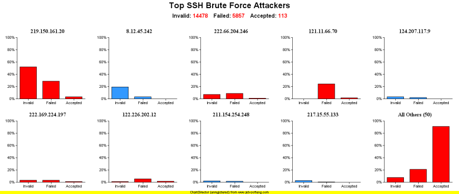
I used Perl and Chart Director to make this trellis chart. The data are from SSHd logs obtained from Challenge 5 at honeynet.org that has been over for a while now.
The charts are sorted by the total number of bad logins. If there was at least one accepted login and the total number of bad logins were greater than the accepted logins, the attack succeeded and the bars are red. Blue means the attack failed. As you may be able to tell, the Invalid, Failed, and Accepted percentages were calculated by the amount_per_IP / amount_per_all_IPs * 100.

