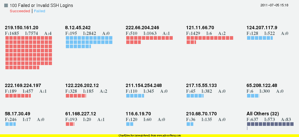
This is my third try at graphing SSHd logs from honeynet.org's Challenge 5. I'm in the process of switching from Perl to Python, so I used Python this time along with Chart Director. However, this is a blatant knock off of Nathan Yau's much better chart: http://flowingdata.com/2011/06/13/largest-data-breaches-of-all-time/. I was just curious to see if I could recreate it with Python and Chart Director using different data.
If you're not familiar with SSHd logs:
"F" stands for "Failed" meaning the wrong password was tried.
"I" for "Invalid" meaning the wrong username was tried.
"A" for "Accepted" meaning the login attempt succeeded.
The numbers show how many "F", "I" or "A" were caused by the IP.

