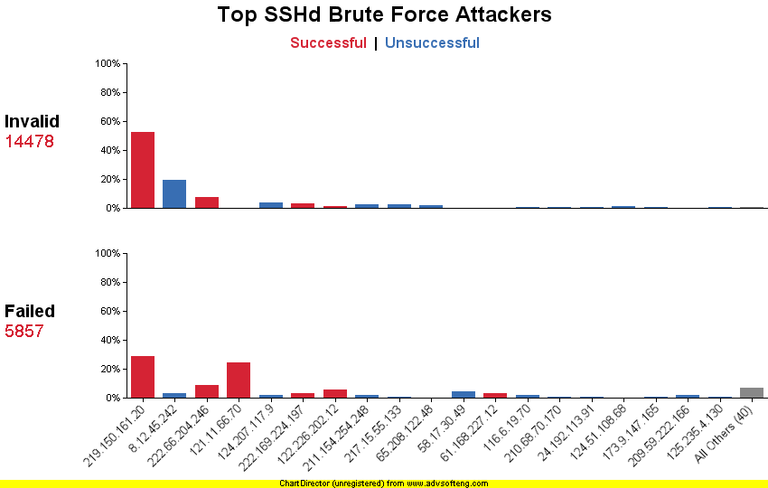
This is my second try at graphing SSHd logs from honeynet.org's Challenge 5. Perl and Chart Director were used to make this chart. The chart has a lot less "chart junk," and is much easier to understand the percentages than my first attempt. Red means there was at least one successful login, while blue means all login attempts failed.

