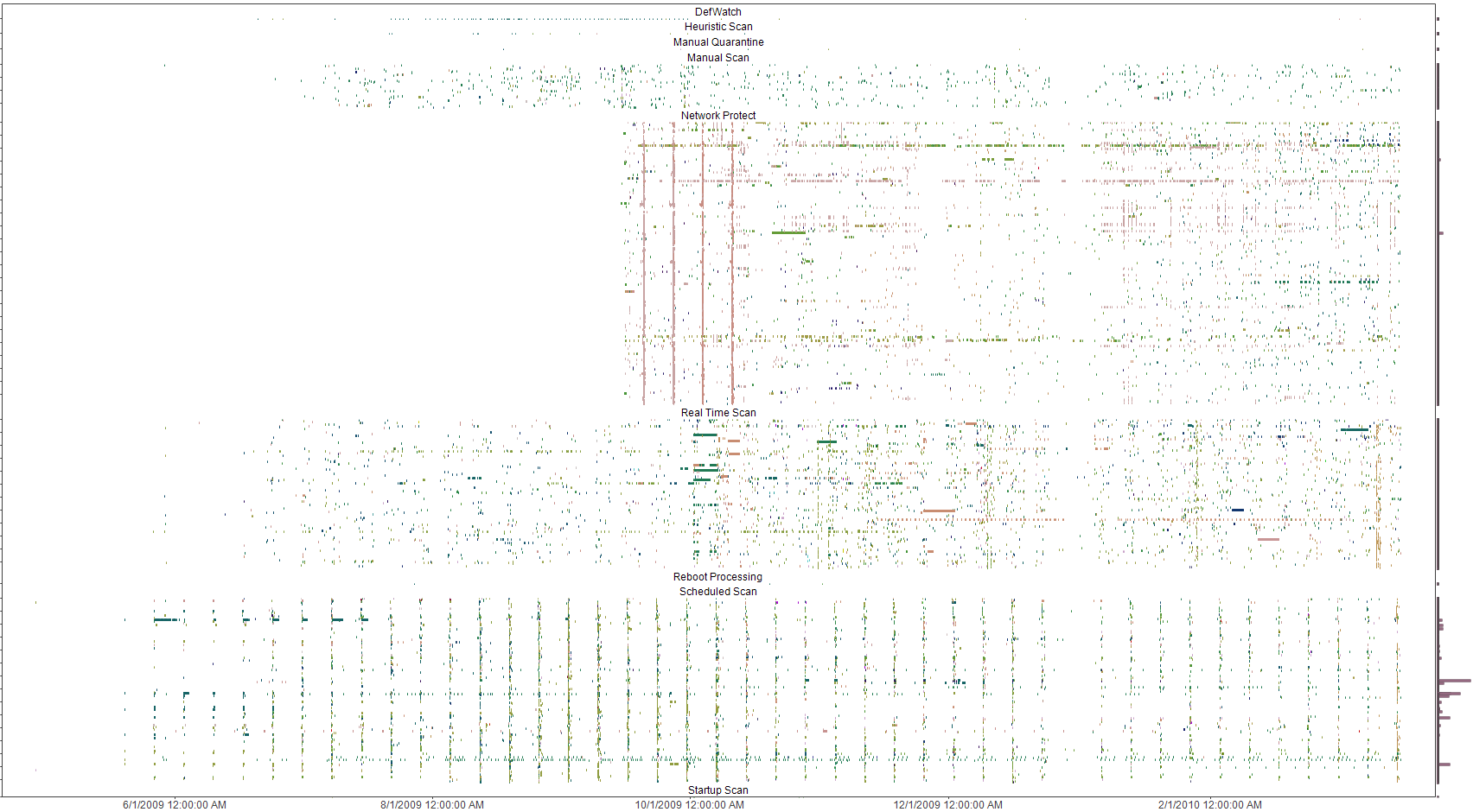
I used a perl script to convert syslog Symantec A/V logs to CSV files and loaded the data into Advizor Analyst. This type of graph shows interesting re-infection patterns for individual hosts (horizontal lines), signature updates following malware blooms (vertical patterns with the same colors) as well as others.

