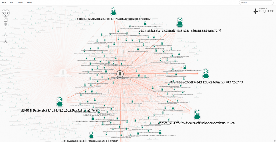
This graph visualization shows the propagation of malware through a deliberately infected computer network. Twelve machines in the network were infected to see how the traffic spread to other machines. Over 7800 machines were included in the dataset.
All network in a single chart. Yellow links indicate benign traffic; red links indicate traffic with at least 1 infected packet. Nodes are sized by volume of traffic.
Data taken from the MyDoom-A.tar.gz, available here
Image generated with KeyLines.

