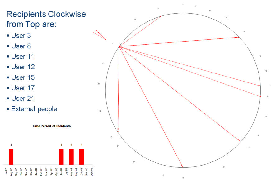
see http://5thsentinel.wordpress.com/2009/04/01/inappropriate-content-visualization/ for background.
This is similar to the Visio diagram that showed all the inappropriate email attachments that a specific user sent. However a time line was included to better articulate number and time of incidents.

