

Mapping the DNS of an organization on the fly using Graphviz. DNS data is collated using regular DNS lookups as well as passive data sets for sub-domains. Map includes IP, Hostname, Netblock Owner and record type.
Adjacent to data visualization are all the different disciplines that help us getting from raw data to visualizations. There are the topics of big data, data mining, and data exploration which come to mind. The world has gotten quite confused and lax about using the terms artificial intelligence and machine learning. Often data mining, for example will be lumped underneath these topics. I have written a few pieces lately that talk about AI and ML in cyber security. They should help bringing a bit more clarity into the approaches and what is suited for the cyber discussion. The topic of data visualization is still a crucial one and I am not doing it justice in any of my write ups. But we shouldn't forget that data visualization is probably one of the most important methods when it comes to helping analysts better understand what they are looking at, and helping data scientists understand what their algorithms have just done.
Oh, and should you be interested in Virtual Reality - I just published a short critique of a 'pro VR' article.
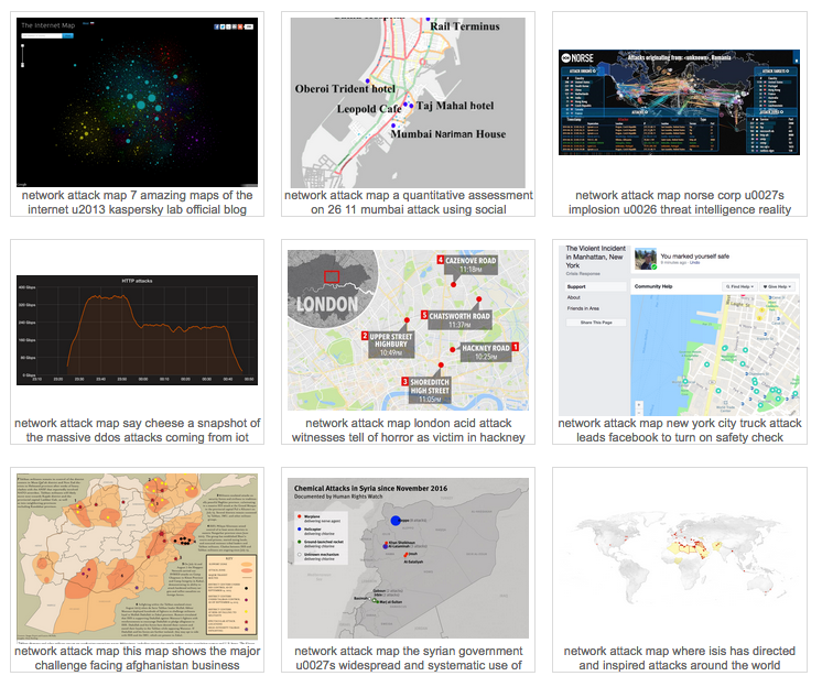
Found a nice collection of network attack maps.
In early December, I gave the keynote at the ACSAC 2017 conference in Orlando, Florida.
In the presentation I look at a number of topics around using big data for security. I start by showing what big data looks like for security, how the history of using security for big data is tightly linked to the progress in big data itself. I talk about machine learning and artificial intelligence and show some of the limits and dangers of how we currently apply machine learning in security and how we can apply data visualization to help analysts better understand data. I then go on to peek a little bit into my magic 8 ball to see how security big data environments might look in the future and finish the presentation with posing a few challenges to the community about security for big data problems.
Hi all,
I am a PhD researcher at University of Southampton and my PhD topic is Visualisation in Cyber Security.
I have a questionnaire, for my thesis, aimed at people who have experience in Cyber Security, Visualization (or HCI) design or both. I would really appreciate if you can take some time out and fill out the questionnaire.
Please refer to the link below for more information or contact me. :)
https://www.isurvey.soton.ac.uk/23438
Thank you.
Aneesha Sethi
Aneesha.Sethi@soton.ac.uk
Big data and security intelligence are the two very hot topics in security. We are collecting more and more information from both the infrastructure, but increasingly also directly from our applications. This vast amount of data gets increasingly hard to understand. Terms like map reduce, hadoop, spark, elasticsearch, data science, etc. are part of many discussions. But what are those technologies and techniques? And what do they have to do with security analytics/intelligence? We will see that none of these technologies are sufficient in our quest to defend our networks and information. Data visualization is the only approach that scales to the ever changing threat landscape and infrastructure configurations. Using big data visualization techniques, you uncover hidden patterns of data, identify emerging vulnerabilities and attacks, and respond decisively with countermeasures that are far more likely to succeed than conventional methods. Something that is increasingly referred to as hunting. The attendees will learn about log analysis, big data, information visualization, data sources for IT security, and learn how to generate visual representations of IT data. The training is filled with hands-on exercises utilizing the DAVIX live CD.
The workshop is being heavily updated over the next months. Check back here to see a list of new topics:
The syllabus is not 100% fixed yet. Stay tuned for some updates.
Day 1:
Log Analysis
SIEM, and Big Data
Data Science
Day 2:
Visualization
Security Visualization Use-Cases
Tools to gather data:
We are also using a number of visualization tools to analyze example data in the labs:
Under the log management section, we are going to discuss:
The section on big data is covering the following:
Raffael Marty is vice president of security analytics at Sophos, and is responsible for all strategic efforts around security analytics for the company and its products. He is based in San Francisco, Calif. Marty is one of the world's most recognized authorities on security data analytics, big data and visualization. His team at Sophos spans these domains to help build products that provide Internet security solutions to Sophos' vast global customer base.
Previously, Marty launched pixlcloud, a visual analytics platform, and Loggly, a cloud-based log management solution. With a track record at companies including IBM Research, ArcSight, and Splunk, he is thoroughly familiar with established practices and emerging trends in the big data and security analytics space. Marty is the author of Applied Security Visualization and a frequent speaker at academic and industry events. Zen meditation has become an important part of Raffy's life, sometimes leading to insights not in data but in life.
We recently posted a case study of how a Fortune 100 company is using Security Visualization as a front end to their various data collection systems. The Security Visualization allows the company's analysts to look at 100's of thousands of correlations each day and apply human pattern recognition to spot the "needles in the haystack". These are threats that are designed to avoid traditional intrusion and event management. Once the potential threat is identified and the log data is carved down to just the logs that are relevant, that subset of log data is then attached to a case study and delivered to case investigation for further evaluation. In addition to identifying and carving down to just the relevant logs, the security visualization also makes it easier to communicate the findings to the extended team.
In this situation data is imported from several sources. Those sources include intrusion detection systems (e.g., SourceFire), firewall protection (e.g., Palo Alto, SonicWALL), and virus scan / endpoint protection (e.g. Symantec) in addition to correlation systems (e.g., HP ESM, Splunk, etc.). Security Visualization allows the analysts to hunt for unknown and unexpected threats. Threats such as time staged attacks, diagonal attacks, cluster attacks, octal jump attacks, embedded activity attacks, etc.
This case study is recorded and can be viewed at http://www.advizorsolutions.com/articles/security-visualization. The case study lasts 25 minutes, and is followed by a Q&A.
Doug Cogswell,
ADVIZOR Solutions, Inc.
Hi, I am a Phd candidate in Informatics Institude at Middle East Technical University. I prepared an online survey as a part of my phd thesis. However, since this subject is relatively new I can not find anybody who may fill this survey around me in Turkey.
The survey is in Google Forms, at link https://goo.gl/forms/xbfmrqJ4jxA4rvQ53. It is not very short :( It may take around 20 minutes but it is easy to fill, mostly composed of multi selection questions. Uncompleted survey results are not saved so the participants should complete the survey.
Although we ask questions related to security systems and security visualization systems used to understand the visualization requirements.The survey, in general, does not include questions that give personal discomfort. No tracking information such as email or organization name is asked during the survey. More descriptive information about how the survey results will be used exists in the starting page. So, please do not hesitate to fill, due to your privacy concerns.
I hope experts of this forum may help me by filling the survey during a coffee break. I need to take feedback soon, before my next thesis committee. I appreciate your help to a newbie security visualization researcher (me) :)
Many thanks,
Ferda Özdemir Sönmez
The 13th IEEE Symposium on Visualization for Cyber Security (VizSec) is a forum that brings together researchers and practitioners from academia, government, and industry to address the needs of the cybersecurity community through new and insightful visualization and analysis techniques. VizSec provides an excellent venue for fostering greater exchange and new collaborations on a broad range of security- and privacy-related topics. VizSec will be held in Baltimore, MD, USA in conjunction with IEEE VIS.
The purpose of VizSec is to explore effective and scalable visual interfaces for security domains such as network security, computer forensics, reverse engineering, insider threat detection, cryptography, privacy, user assisted attacks prevention, compliance management, wireless security, secure coding, and penetration testing.
Technical Papers
Full papers describing novel contributions in security visualization are solicited. Papers may present techniques, applications, practical experience, theory, analysis, experiments, or evaluations. We encourage the submission of papers on technologies and methods that promise to improve cyber security practices, including, but not limited to:
- Situation awareness and/or understanding
- Incident handling including triage, exploration, correlation, and response
- Computer forensics
- Recording and reporting results of investigations
- Assisting proactive security configuration and deployment
- Reverse engineering and malware analysis
- Vulnerability management
- Multiple data source analysis
- Analyzing information requirements for computer network defense
- Evaluation and/or user testing of VizSec systems
- Criteria for assessing the effectiveness of cyber security visualizations
(whether from a security goal perspective or a human factors perspective)
- Modeling system and network behavior
- Modeling attacker and defender behavior
- Studying risk and impact of cyber attacks
- Predicting future attacks or targets
- Security metrics and education
- Software security
- Mobile application security
- Social networking privacy and security
When applicable, visualization and interaction techniques that effectively capture the insights of human analysts and/or allow analysts to collaborate efficiently are particularly desirable.
*** New for 2016! *** Case Studies
Short papers describing practical applications of security visualization are solicited. We encourage the submission of papers discussing the introduction of cyber security visualizations into operational context, including, but not limited to:
- Cases where visualization made positive contributions towards meeting
operational needs
- Gaps or negative outcomes from visualization deployments
- Situations where visualization was not utilized, but could have had a
positive impact
- Lessons learned from operational engagements
- Insights gained from the transition process
Cyber security practitioners from industry, as well as the research community, are encouraged to submit case studies.
Posters
Poster submissions may showcase late-breaking results, work in progress, preliminary results, or visual representations relevant to the VizSec community. The poster program will be a great opportunity for the authors to interact with the attendees and solicit feedback.
Submissions
Submissions must be formated using the IEEE VGTC template that can be found at http://junctionpublishing.org/vgtc/Tasks/camera.html. All submissions should be in PDF format.
Submit papers and poster abstracts using EasyChair: http://www.easychair.org/conferences/?conf=vizsec2016
Papers should be at most 8 pages including the bibliography and appendices. Papers will be peer-reviewed by at least 3 members of the program committee. Committee members are not required to read the appendices or any pages past the maximum. Submissions not meeting these guidelines will be rejected without consideration of their merit. Reviews are single-blind, so authors may include names and affiliations in their submissions. Submitted papers must not substantially overlap papers that have been published or that are simultaneously submitted to a journal or a conference with proceedings.
The VizSec proceedings will be published by IEEE. Authors of accepted papers must guarantee that their papers will be presented at the conference.
Case Studies
Case studies should be at most 4 pages including the bibliography and appendices. Case study submissions will be reviewed by the Paper Chair(s) and other members of the organizing committee to determine relevance to the VizSec community.
Accepted case study authors will have time to present their work at VizSec during the program.
Accepted case studies will be made available on this website.
Extended abstract for posters should be at most 2 pages including the bibliography. Poster abstracts will be reviewed by the Poster Chair(s) and other members of the organizing committee to determine relevance to the VizSec community.
Accepted authors must present a corresponding poster during the workshop. The poster authors can determine the layout by themselves, but the dimensions of the posters should not exceed the A0 space (841mm x 1189mm or 33.1" x 46.8"). Additionally, poster authors are requested to give a brief oral preview during a plenary "fast forward" session.
Accepted poster abstracts will be made available on VizSec website.
When applicable, submissions including tests and evaluations of the proposed tools and techniques are considered particularly desirable. If possible, making the data used for the tests available will also be considered positively. If you do not have real-world data to demonstrate your visualization, you may be interested in looking at the VAST Challenge data sets.
Important Dates
All deadlines are 5:00 PM PST
Papers and Case Studies
August 1, 2016
Submission for Papers and Case Studies
September 5, 2016
Author Notification for Papers and Case Studies
October 3, 2016
Camera Ready Submission and Copyright Forms for Papers
Posters
September 19, 2016
Abstract Submission for Posters
September 30, 2016
Author Notification for Posters
We've created a free tool for visualizing live streams of network traffic, using JMonkeyEngine (Java 3D gaming engine).
Please take a look at deepnode.com - we would very much appreciate feedback from this community.
Rather than focusing on mining of static datasets, this tool focuses on seeing activity over time, and controlling the timeline so that a human can connect the dots. Here's a link to information on the concept behind the visualization style.
As for the screenshot, this video explains what you're looking at.
I attended Visual Analytics Workshop last year at BlackHat and have gotten endless use from afterglow, neato, etc to make interesting visualizations.
Here is a short youtube video I put together, with attack data taken from Nginx logs:
(Music is by a local San Francisco band: Vetiver)
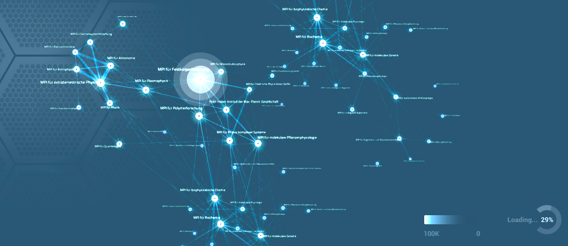
Over at dnsdumpster.com I created a DNS recon tool that generates a DNS map on the fly using 80+GB of DNS data from the scans.io project. This map is the secviz.org domain.

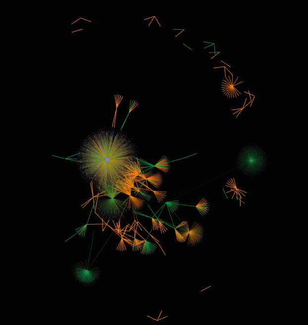
This graph visualization shows the propagation of malware through a deliberately infected computer network. Twelve machines in the network were infected to see how the traffic spread to other machines. Over 7800 machines were included in the dataset.
All network in a single chart. Yellow links indicate benign traffic; red links indicate traffic with at least 1 infected packet. Nodes are sized by volume of traffic.
Data taken from the MyDoom-A.tar.gz, available here
Image generated with KeyLines.

Visualization showing botnet activity geographically. The time bar at the bottom shows temporal trends and filters traffic shown on the map.
Data from http://www.caida.org/data/passive/sipscan_dataset.xml.
Image generated using KeyLines.
.thumbnail.png "Botnet traffic")
Using a dataset from http://www.uvic.ca/engineering/ece/isot/datasets/index.php, this graph shows botnet traffic between 5000 computers at the University of San Diego. Different colors were used to indicate different protocols. Nodes represent computers and were sized by degree. Edges represent packets, weighted by packet size. Image generated using KeyLines.
Visual Analytics, especially the exploration of data requires a scalable and flexible data backend. It is not uncommon that gigabytes, maybe even terabytes of data need to be queried for a specific analytics tasks. Furthermore, the more context around log data is available, the more expressive the data gets and the deeper the insight that can be discovered in the data. How can we gather all that context and combine it with both network-based, as well as host-based data? What are the data access requirements? How can we run data mining algorithms, such as clustering across all of the data? What kind of data store do we need for that? Do we need a search engine as a backend? Or a columnar data store?
I recently wrote a paper about the topic of a security data lake that is a concept of a data backend enabling a variety of processing and access use-cases. A short introduction to the topic is available as well.
Maybe at a later point in time, I will try to address the topic of data science and techniques, as well as workflows to make all that big data actionable. How do you take a terabyte of data and find actual insights? Just dropping that data into a network graph visualization is not going to help. You need a bit more to make that happen. But again, more on that later.
If you want to learn more about how to visualize and analyze terabytes of data, attend the Visual Analytics Workshop at BlackHat 2015 in Las Vegas.
Again, here is where you download the paper.

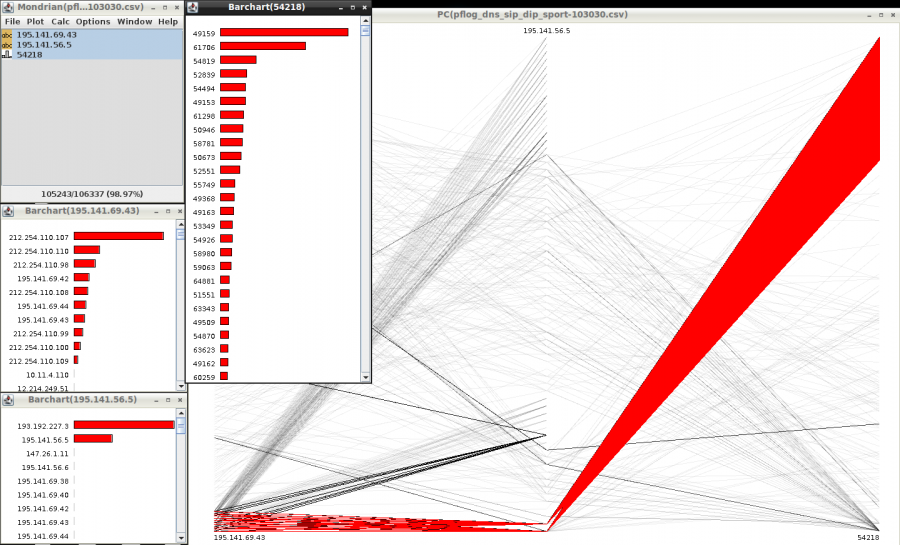
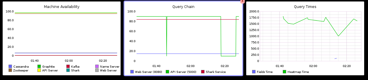
This is a screenshot from a tool called Mondrian where we show network traffic. DNS traffic in particular. The bar charts show the breakdown of sources, destinations, and ports. The parallel coordinate shows all three variables at the same time. The red parts highlight an interesting visual pattern. What is it?

This link graph shows communications of my laptop. The big cluster in the middle is Web traffic. The surroundings are all kinds of processes running under OSX. The output was rendered in WebGL. Copyright 2015 pixlcloud llc.

This image shows a network flow graph of flow events. The output is rendered in WebGL through a proprietary tool. Copyright 2015 pixlcloud llc
